City Hardware is a privately owned hardware shop. The owner wanted to refresh the brand with a new style that would appeal to hands-on DIY-ers with a retro branding in the style of early to mid 20th century american signage.
We have selected a classic hand-lettered wordmark as the most obvious and classic choice. The discovery phase started with exploring classic styles from that era to identify the exact typography, colours and badge shapes that would perfectly match the positioning of the brand.
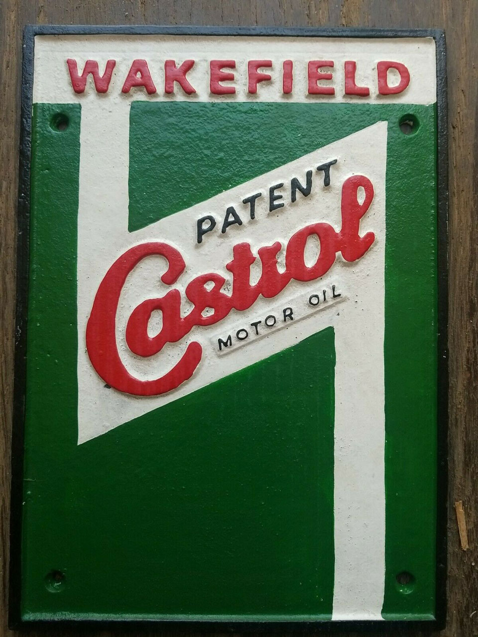
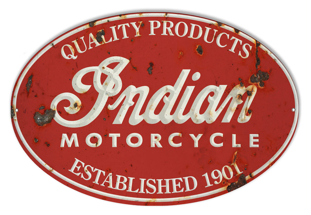
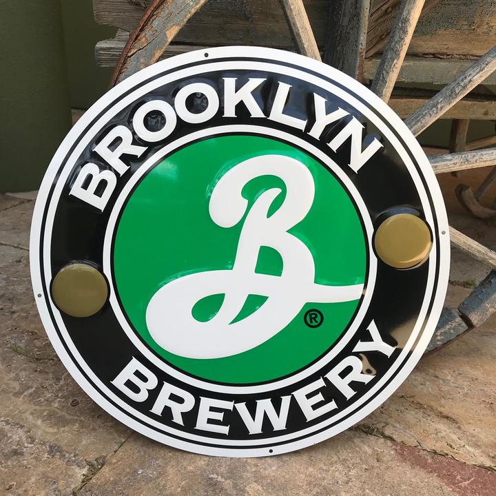
In the final design I have incorporated the main features of the era's style with hand-lettered cursive fonts and distinct retro colours but in a slightly modernised style with simpler typography and cleaner lines to make the wordmark more legible, especially at smaller size on electronic devices.
"Good work ! He was very careful at my needs and offered me pro active support!"
- Jason Hurst