DAY7 Hospitality Group
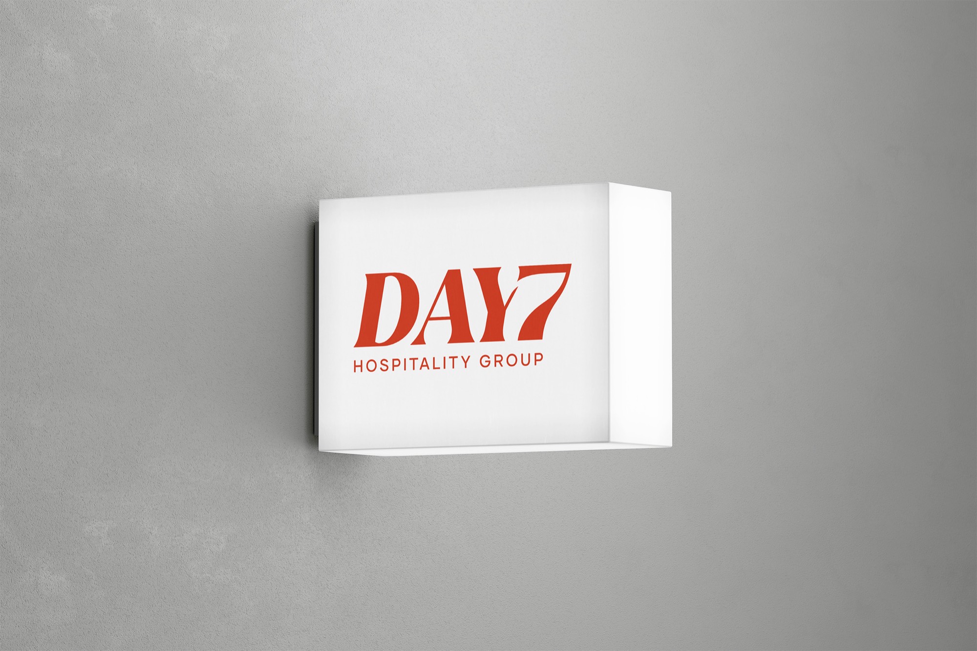
The group behind a Korean day spa and an indoor golf cafe needed a mark of its own. Its new wordmark draws the Y and the 7 as one shape.

DAY7 Hospitality Group runs Island Spa & Sauna, a 30,000 sq ft Korean day spa in Edison, New Jersey, and Birdies & Lattes, an indoor golf facility and cafe.
Each venue had its own brand, and the group above them had none. Its name refers to the seventh day as a day of rest, which is what both businesses offer: wellness, relaxation and play. As a management group it would rarely put its logo on a product, so the mark had to work on business cards, email signatures and screens.
A clean logo, not too elaborate, for the group that creates and runs the venues.
How we found the answer.
Discovery and four concepts
Weeks 1–2Of four concepts, the client liked the 7 built into the name and asked for a text-forward logo.
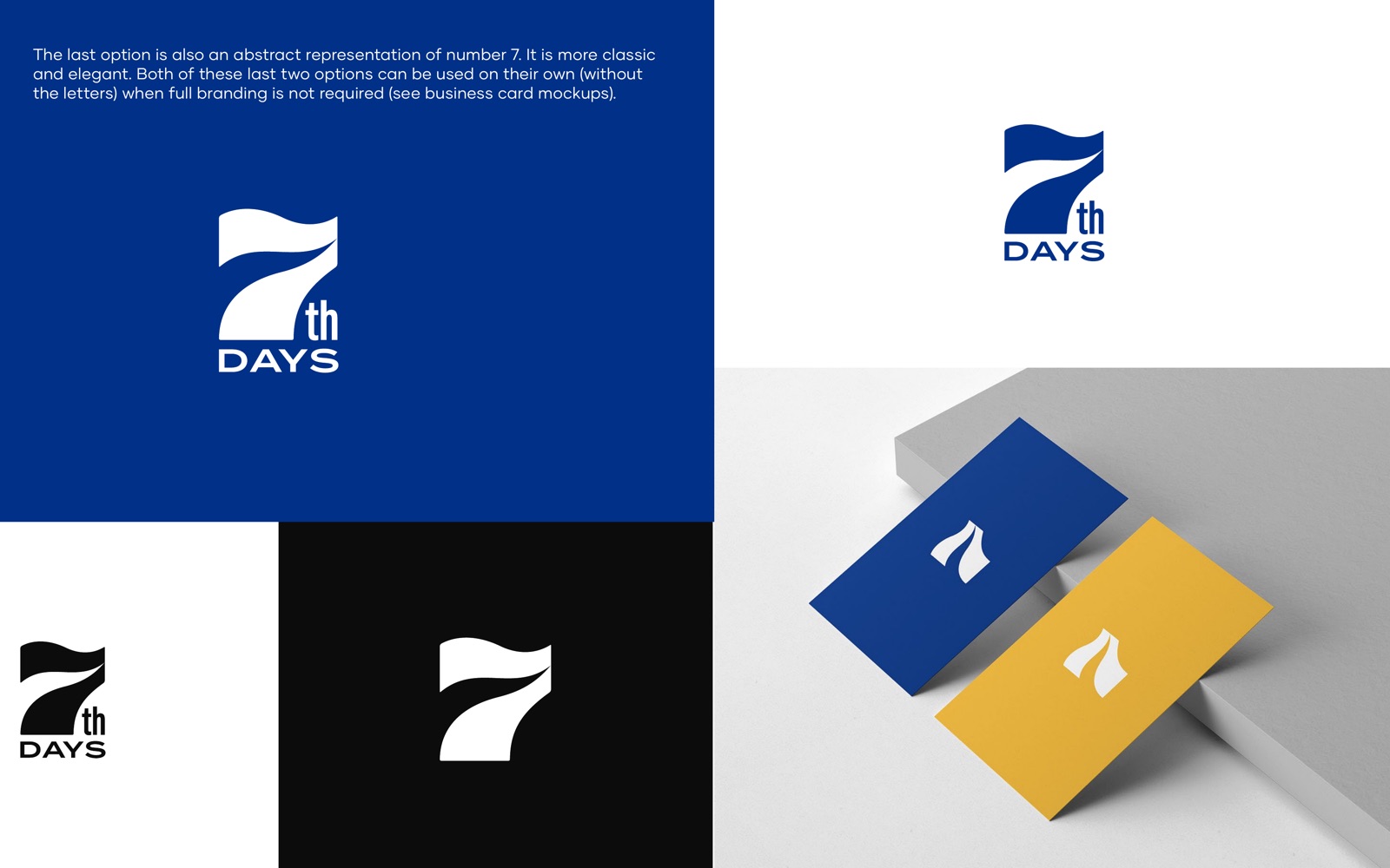
Two questionnaires covered the market, competitors, audience and visual taste. Our style proposal recommended a middle ground between the classic crests common in hospitality and the cold, geometric marks of tech companies. We then drew four concepts for the group's first name, 7th Days: a sun of seven rays with the seventh picked out, a seven-pointed star, and two stylised 7s. The client found the sun too close to a corporate pharmacy and the star too familiar, and liked the large 7 joined to the name. The request that followed was a cleaner logo, led by the name itself, with any symbol kept subtle.
A new name, one wordmark
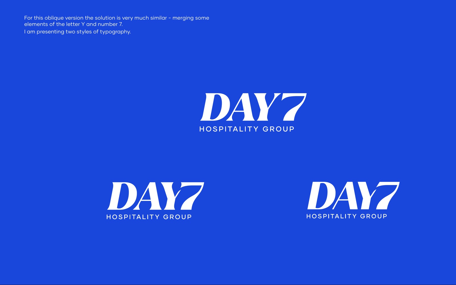
Week 3When 7th Days became Day 7, we drew the Y and the 7 as one shape.
We drew wordmarks in two styles, an upright sans and an oblique serif. Partway through, the group changed its name to Day 7 Hospitality Group. Reversing the order left a wide gap between DAY and 7, so we merged the arm of the Y into the stroke of the 7, in both styles. The client chose the oblique serif and asked to see more space between DAY and 7. We advised keeping them joined: the joined form reads as one logo, and the shape of the 7 already separates it from the letters. The client agreed.
Colour, guideline and cards
Week 4The client chose a red close to orange, which became chilli red across the system.
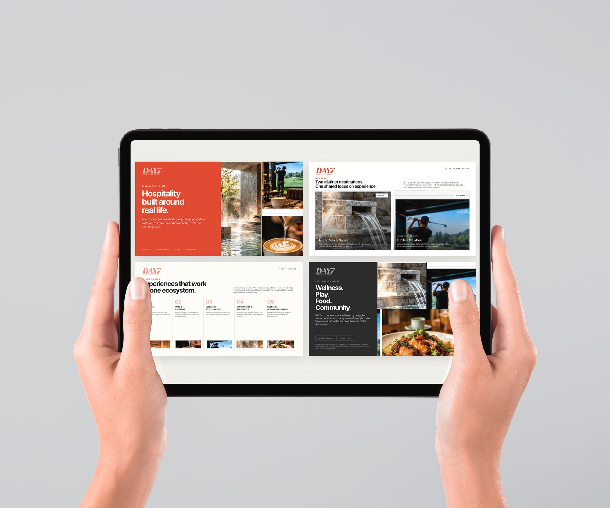
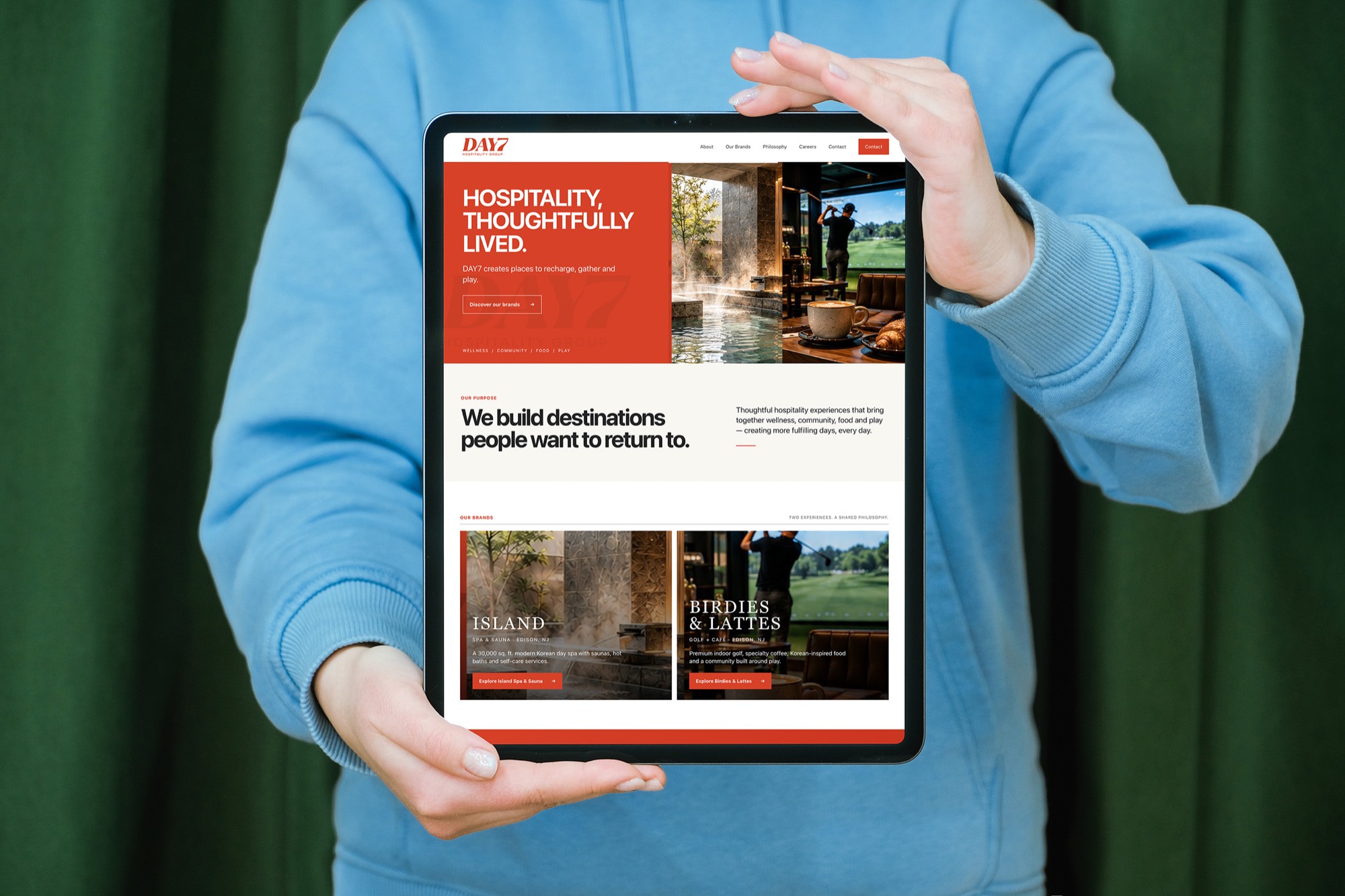
We showed four palettes: a soft sky blue, a salmon red, a deep blue-green and a red closer to orange that recalls a sunset. The client chose the last, saying red and orange stand for passion, relaxation and determination. Chilli red leads three primary reds, with four greys behind them, and Gilmer Bold and Regular set the type. The guideline covers the logo with and without its strapline, four colour versions, the clear space and a 120-pixel minimum width. Business card templates followed, set up so the team can add each person's details and send them to print.
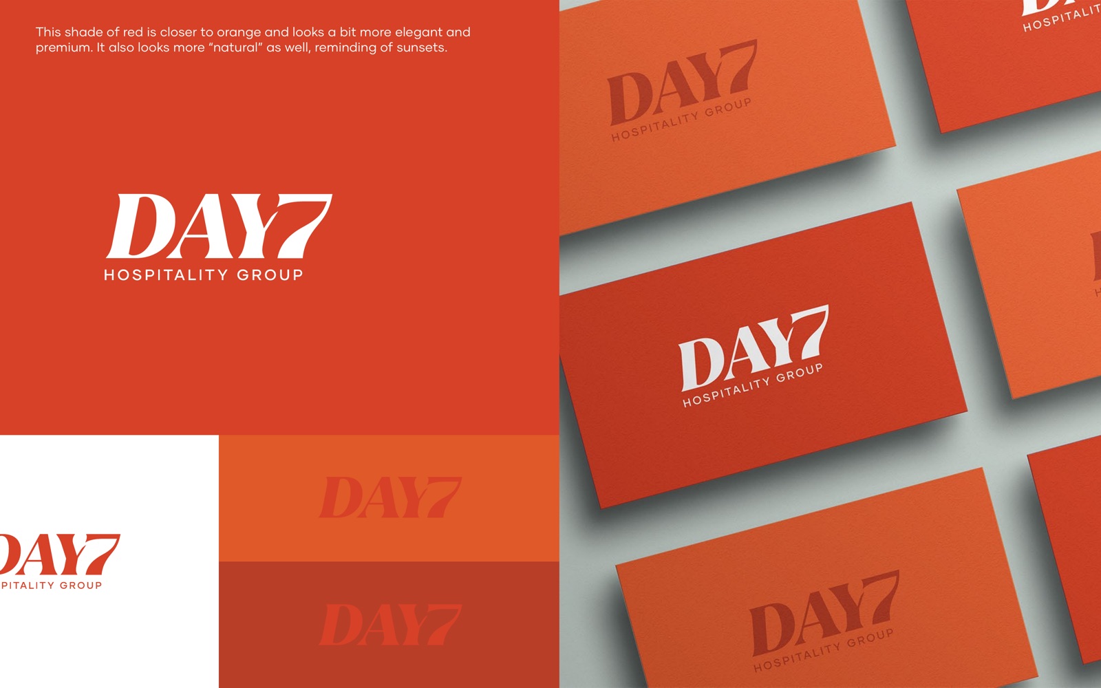
A wordmark-led identity: the name in an oblique serif, with HOSPITALITY GROUP set below in Gilmer.
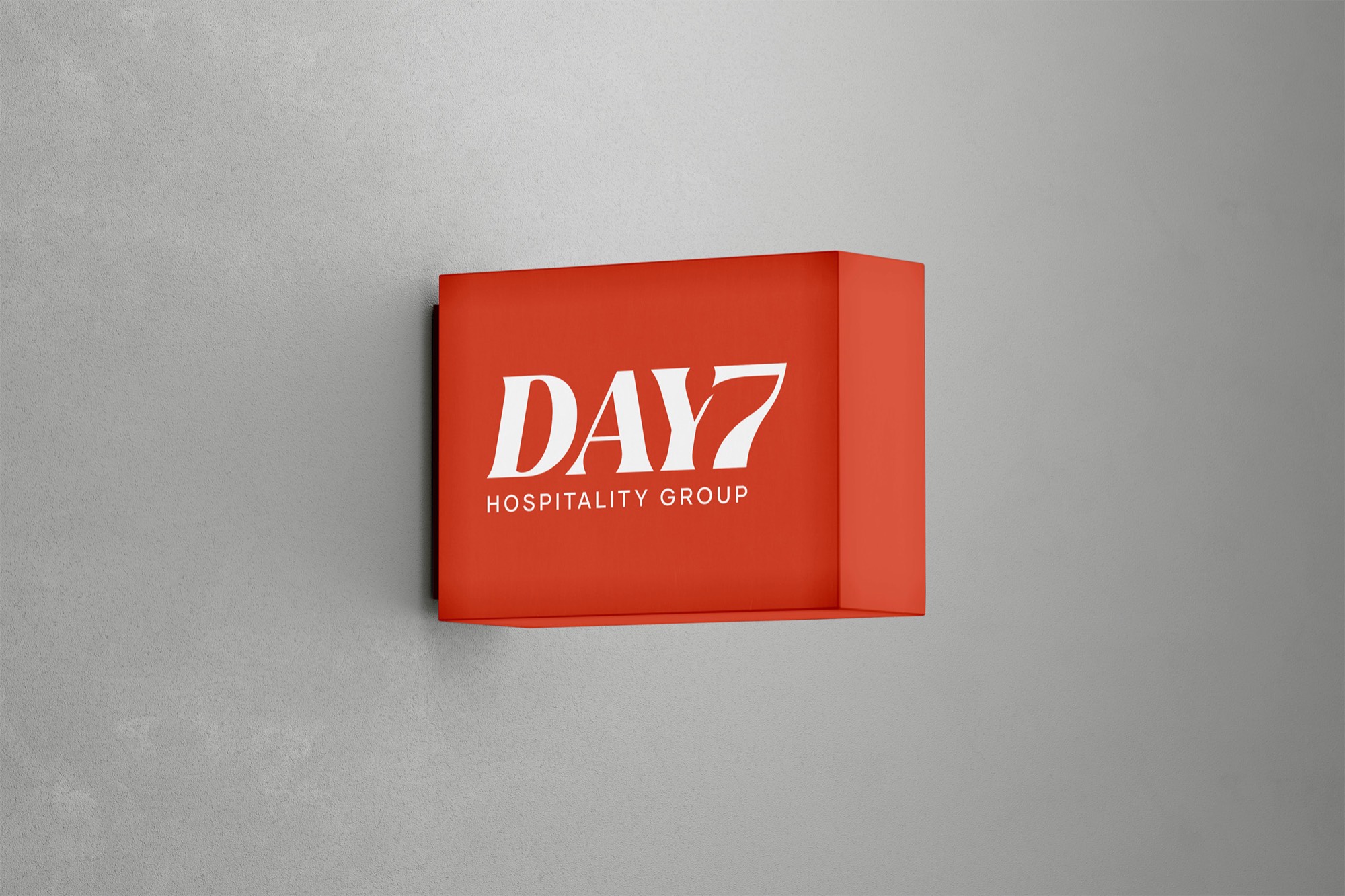
An elegant serif in a warm chilli red, modern enough to stand apart from the crests of classic hotel groups.
The seventh day carried by the name itself, with the Y and the 7 drawn as one shape.
Every month without a coherent brand is lost ground.
In a free 30-minute call, Aidar will show you where your identity and website are costing you clients. Afterwards, you'll get a one-page summary with your top three fixes.
No commitment and no pitch deck. We take on at most three projects at a time.