
Rebrand · Brand Guidelines
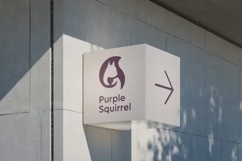
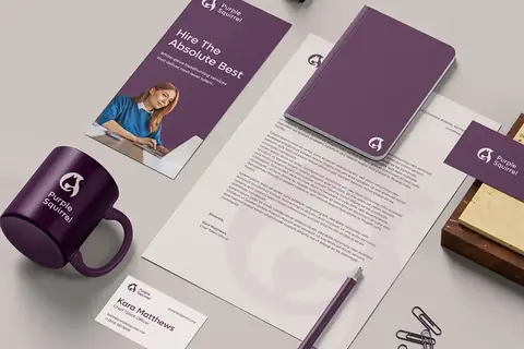
Purple Squirrel
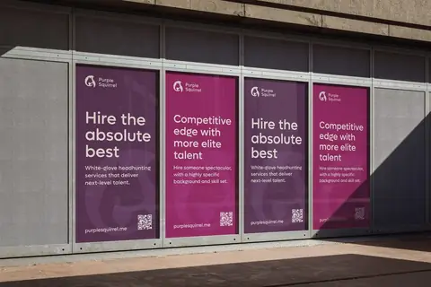
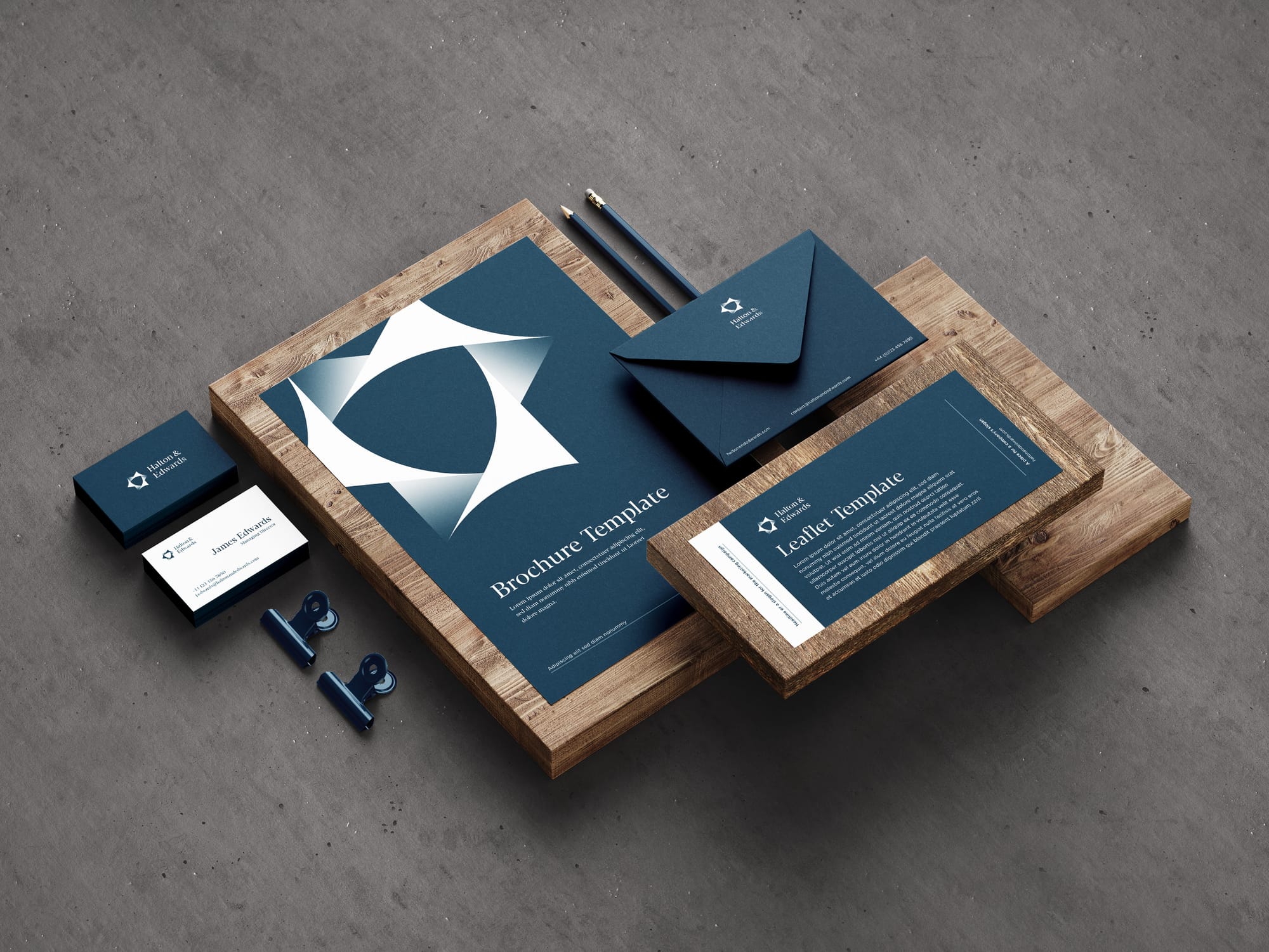
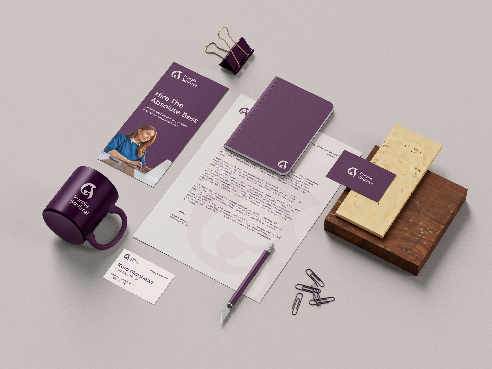
An executive search firm whose cartoon mascot looked like a smaller, more casual company. The new mark keeps the squirrel and holds up from a badge to a billboard.
View case study : Purple SquirrelRight now, your website, social pages and sales materials may each look like a different company. We design your brand identity and website as one project, so every first impression matches the work you do.
LinkedIn first. Then your website. Then the deck you sent.
Different logo, colours and tone. Your buyer notices and says nothing.
Doubt arrives before you've said a word. It shows up later as a lower price, a slower decision, or silence.
They simply choose someone who looked more certain.
But it doesn't have to look like this.
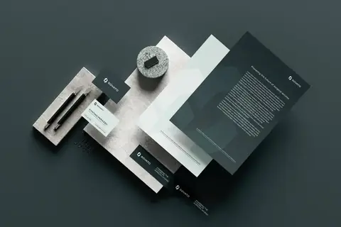
Illustrative example. Northfield is a fictional company.
Your profile, website and deck now look like the same company.
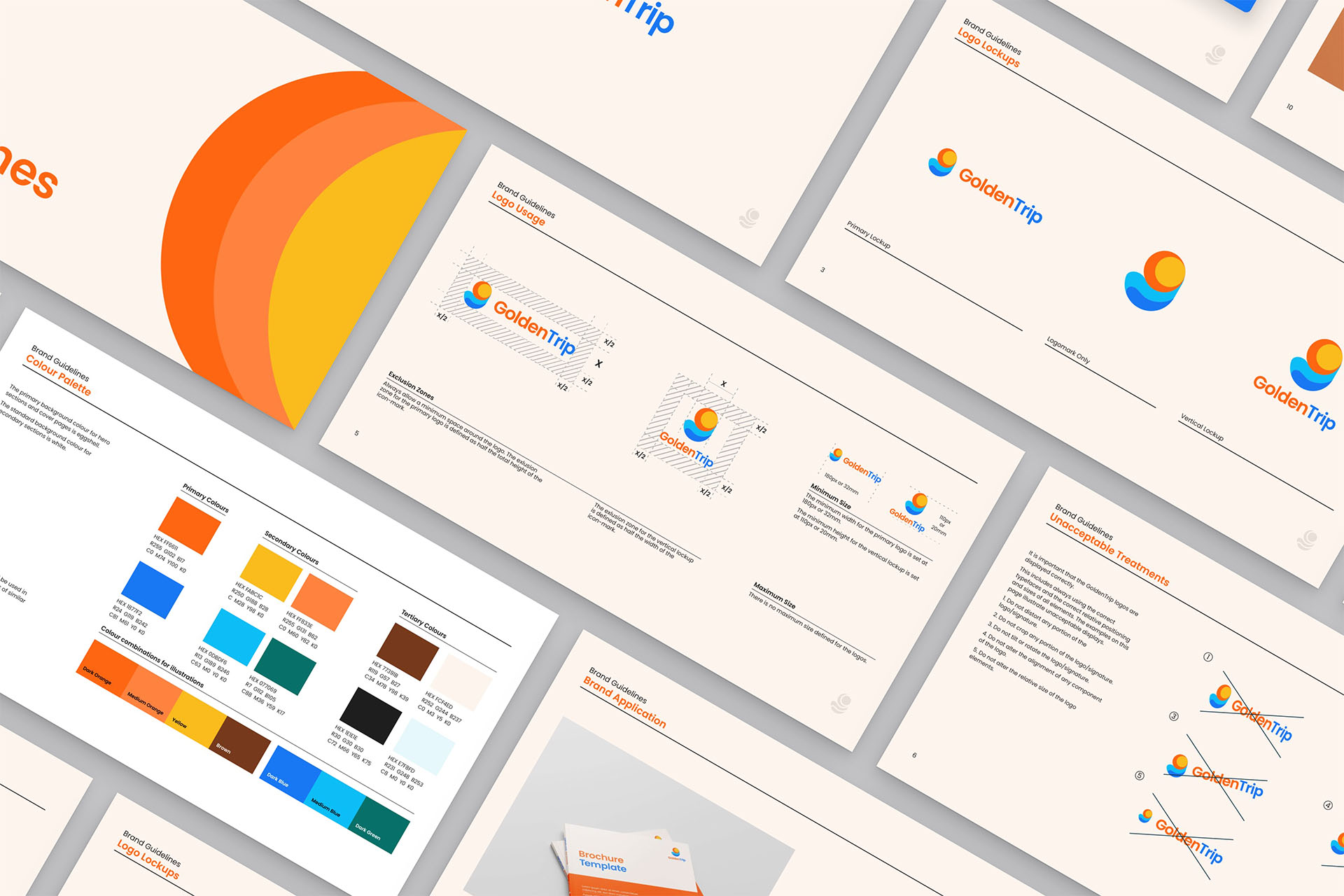
Brand guidelines, so the next deck, post or page still looks like you.
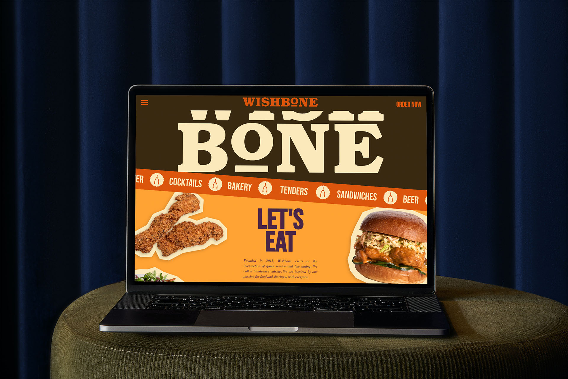
Designed from the same brand, so your website matches everything people have already seen of you.
Before they buy, they look you up. LinkedIn first. Then your website. Then the deck you sent.
Three places. Three different companies. Different logo, colours and tone. Your buyer notices and says nothing.
“Are these even the same company?” Doubt arrives before you've said a word. It shows up later as a lower price, a slower decision, or silence.
They never tell you why. They simply choose someone who looked more certain.
But it doesn't have to look like this.
One company, on every screen.
One logo, one palette, one voice. Your profile, website and deck now look like the same company.
Rules your team can follow. Brand guidelines, so the next deck, post or page still looks like you.
A website that backs up the first impression. Designed from the same brand, so your website matches everything people have already seen of you.
The three browser windows above are an illustrative example of a fictional company, Northfield.
Four stages, and you make the key decisions at each one.
Your business, buyers and competitors. You sign off the strategy before any design starts.
Logo, colour, type and voice. You choose the direction, then we refine it.
A website designed from the brand. You approve the design before we build it.
Launch, handover and 30 days of support included.
Brands we've worked with, in 11 countries
Strategy and design stay with the same two people from the first call to launch. You always know who is doing the work.

Design and build
Aidar Amrekulov
10+ years in graphic design, 8+ in brand identity.

Brand strategy
Dalida Murat
10+ years building brands at multinationals, including Lactalis.
Brand identity: 3 to 5 weeks. Website: 4 to 6 weeks. Together: 7 to 9 weeks with a clear schedule.
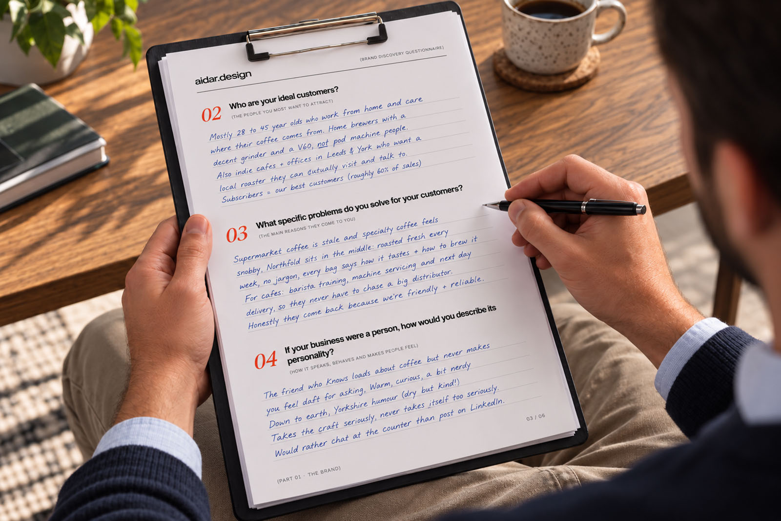
In a free 30-minute call, Aidar will show you where your identity and website are costing you clients. Afterwards, you'll get a one-page summary with your top three fixes.
No commitment and no pitch deck. We take on at most three projects at a time.
Not ready to talk yet?
5 signs your visual identity is costing you clients, and what to do about each one.
You'll also get the occasional note from us. Unsubscribe anytime. See our Privacy Policy.