Online Speechie
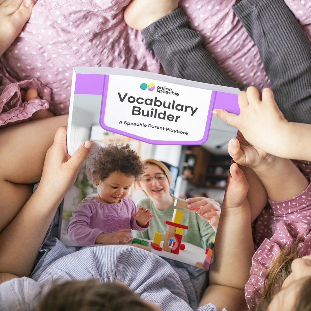
A playful, trustworthy identity and website for a speech-pathology service that helps parents of late talkers teach their children at home.

The parents who use Online Speechie are worried that their child isn't talking, and already have too much on their plate.
The service is run by a speech pathologist and helps parents of late talkers teach their children at home, through courses, playbooks and an activity library. It was rebuilding its whole website and needed a logo to go with it. That logo had to feel playful enough that using it never felt like another chore, and clean enough that a worried parent would trust it with their child's development. The old palette was yellow, orange and green.
Playful enough that it never feels like a chore, and professional enough to be trusted.
How we found the answer.
Concepts and direction
12–25 MarchWe began with the client's own idea, a child's face made from the letters OS. We advised that the letters would read more clearly if the O became an eye, and asked a bigger question: does the mark say speech? We then presented style directions and a set of logo concepts. The client chose a toy-block direction, and one design in particular, and asked us to keep exploring it.
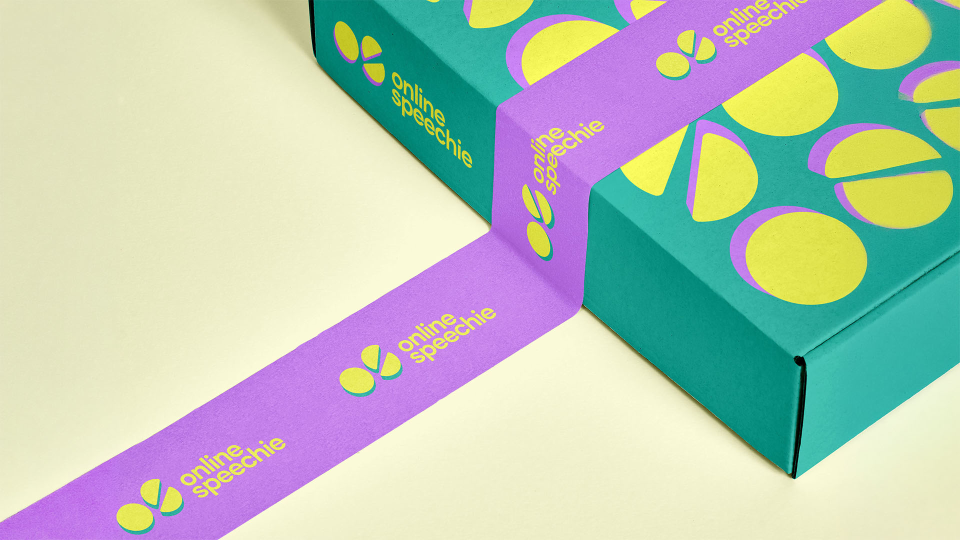
Logo, palette and type
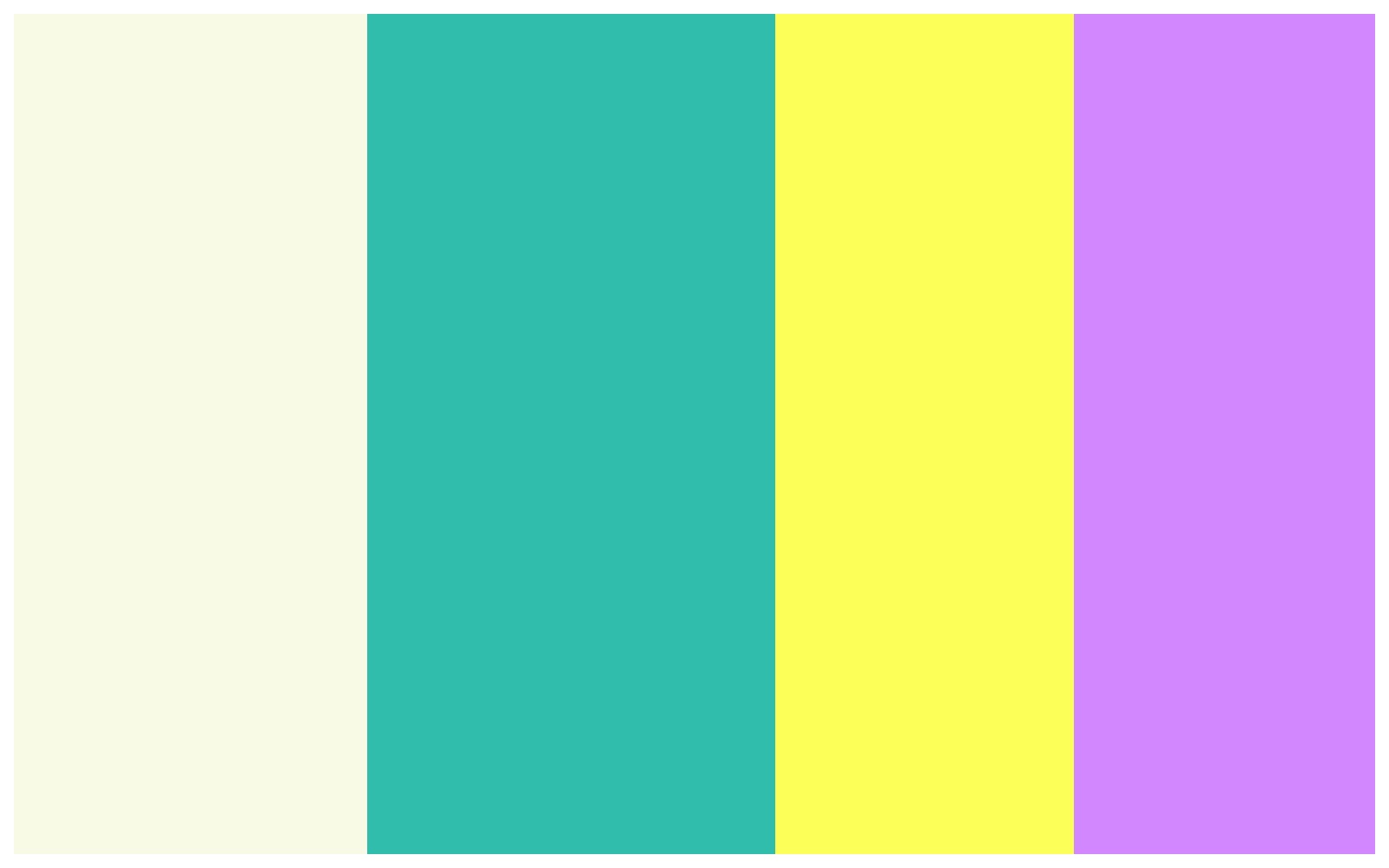
4–15 AprilWe refined the block mark alongside a typographic alternative and tested both in several palettes. The client wanted yellow and teal in paler tones, but bold teal and yellow do not sit well together. We softened the shades and added purple, which suits both. A lighter, sunnier yellow worked better with the teal than the deeper egg-yolk yellow. Asked which logo we would choose, we picked the block mark, because it becomes a brand pattern, works as a mask for photography and reads at once as a children's brand. The client agreed. Gilmer, a geometric sans, set the type. Final logo files followed in May.
Website design
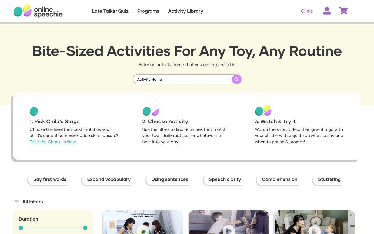
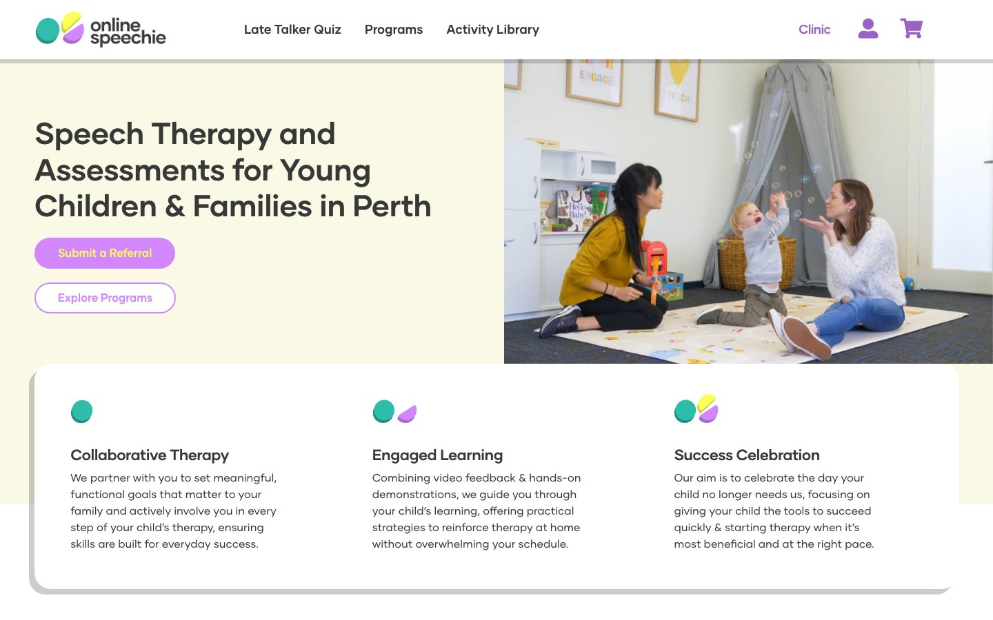
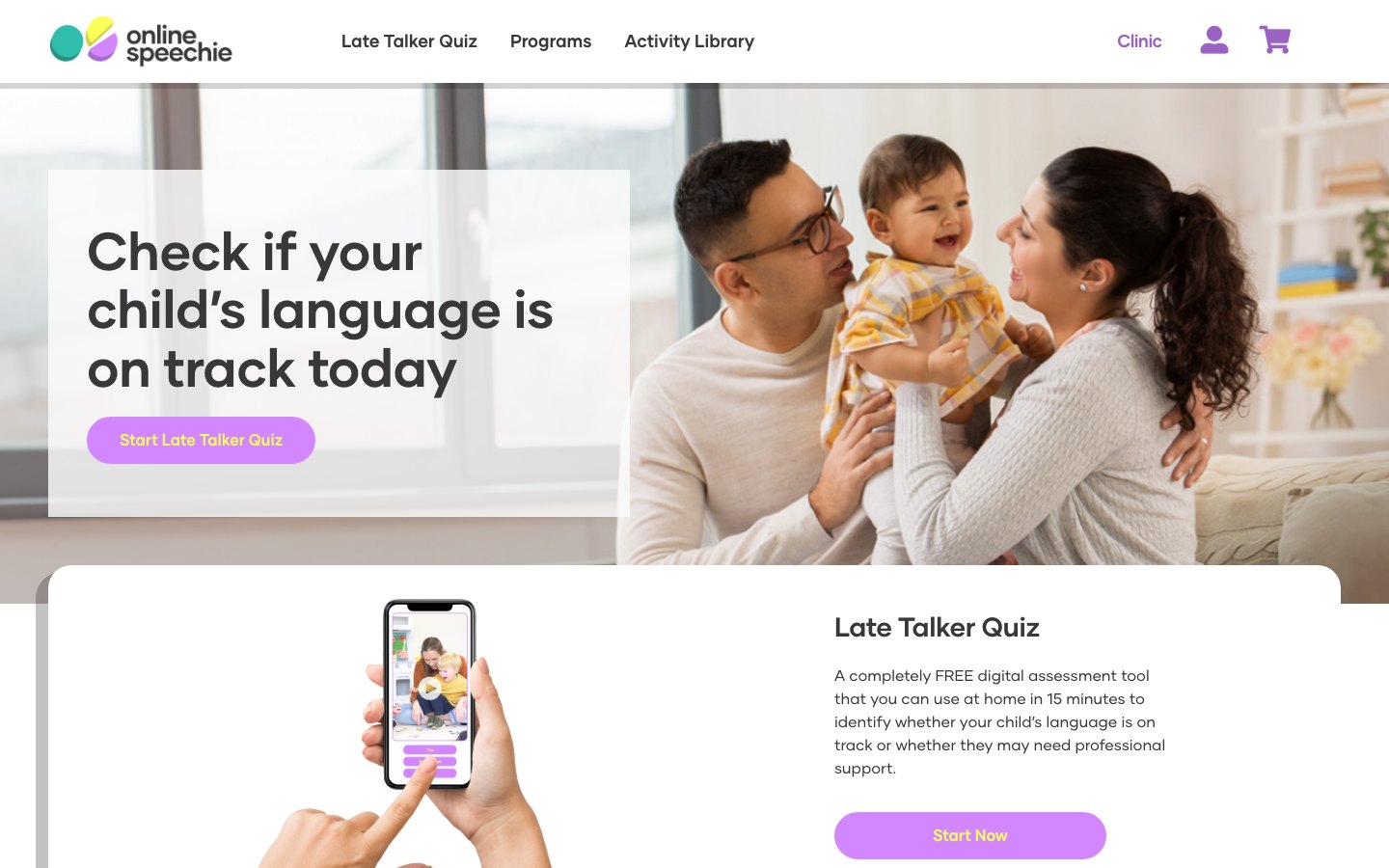
16 April to JulyThe client asked to see the identity on a real layout before locking a style guide, so we designed the home page first, then the Language Check-in, Clinic, Activity Library, Guides and Programs pages, a product page template and mobile layouts. We drew custom icons and tested illustration styles as the client's needs became clear. When the Programs page felt busy, we moved it to a simpler, cleaner layout, and the client's reaction was that it was much clearer.
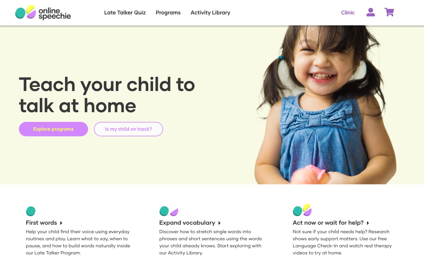
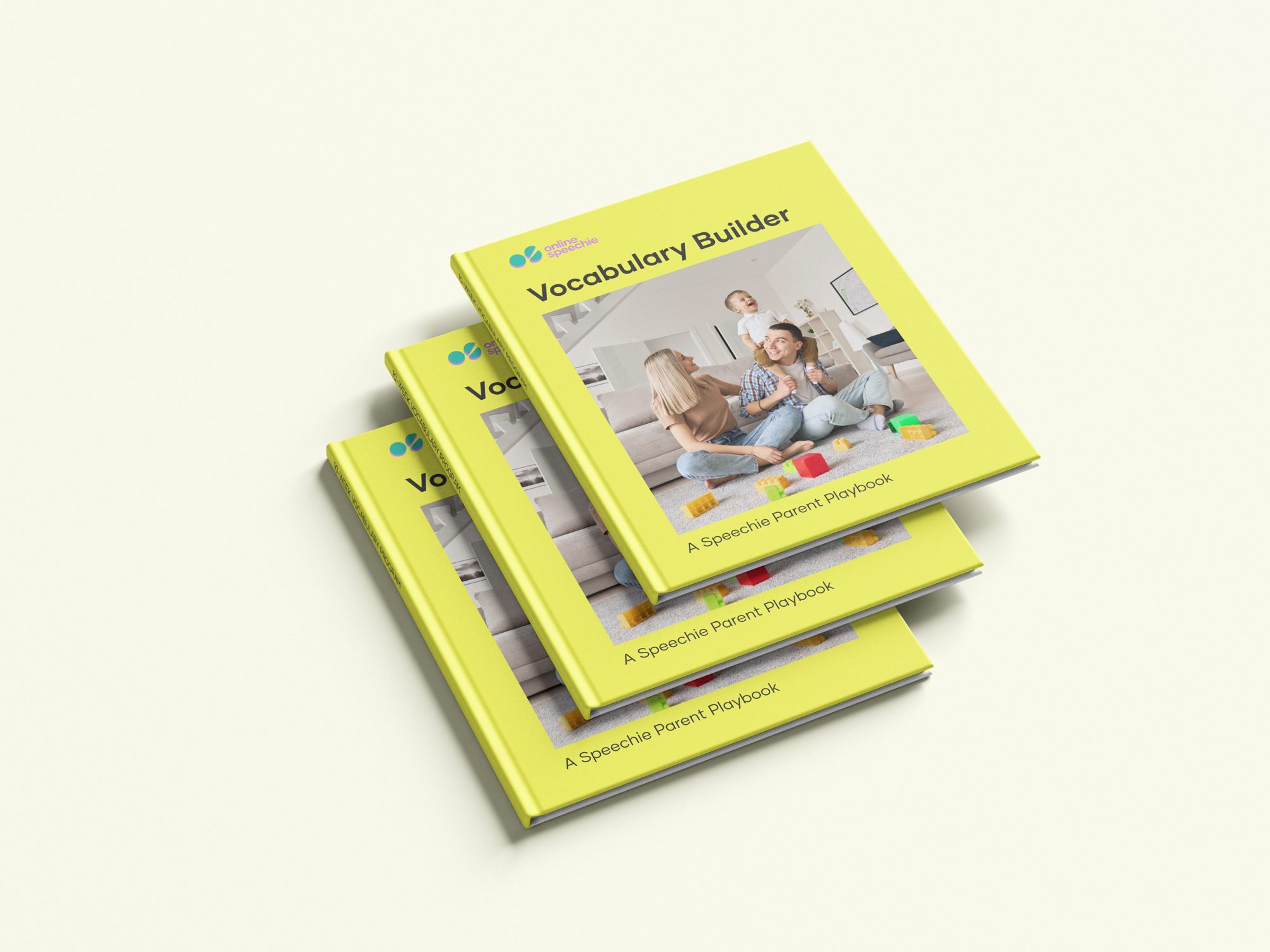
A block mark in teal, yellow and purple that turns into pattern, packaging and a photo mask, and a live website where every page uses it.
Every month without a coherent brand is lost ground.
A free 30-minute audit will show you where your identity and website are costing you clients, and what it would take to fix it.
No commitment and no pitch deck. Just a clear assessment.