Sovato
A logo for a remote-surgery startup: a compact monogram of two interlocking halves, built to sit in software as comfortably as on a sign.

Sovato is building a remote surgery platform that does not exist anywhere else, and it needed a logo that looked as advanced as the technology.
The company was in stealth mode and working from its own slides. Its brief asked for a brand that felt deep tech, cutting edge and future-thinking, in a palette that stayed fresh, personable, modern and clean. The mark also had to live inside a software product, so it had to be slick and contained enough for web, mobile and app interfaces.
A mark that looks as advanced as the surgery it makes possible, and stays simple enough for a software interface.
How we found the answer.
Style direction and first options
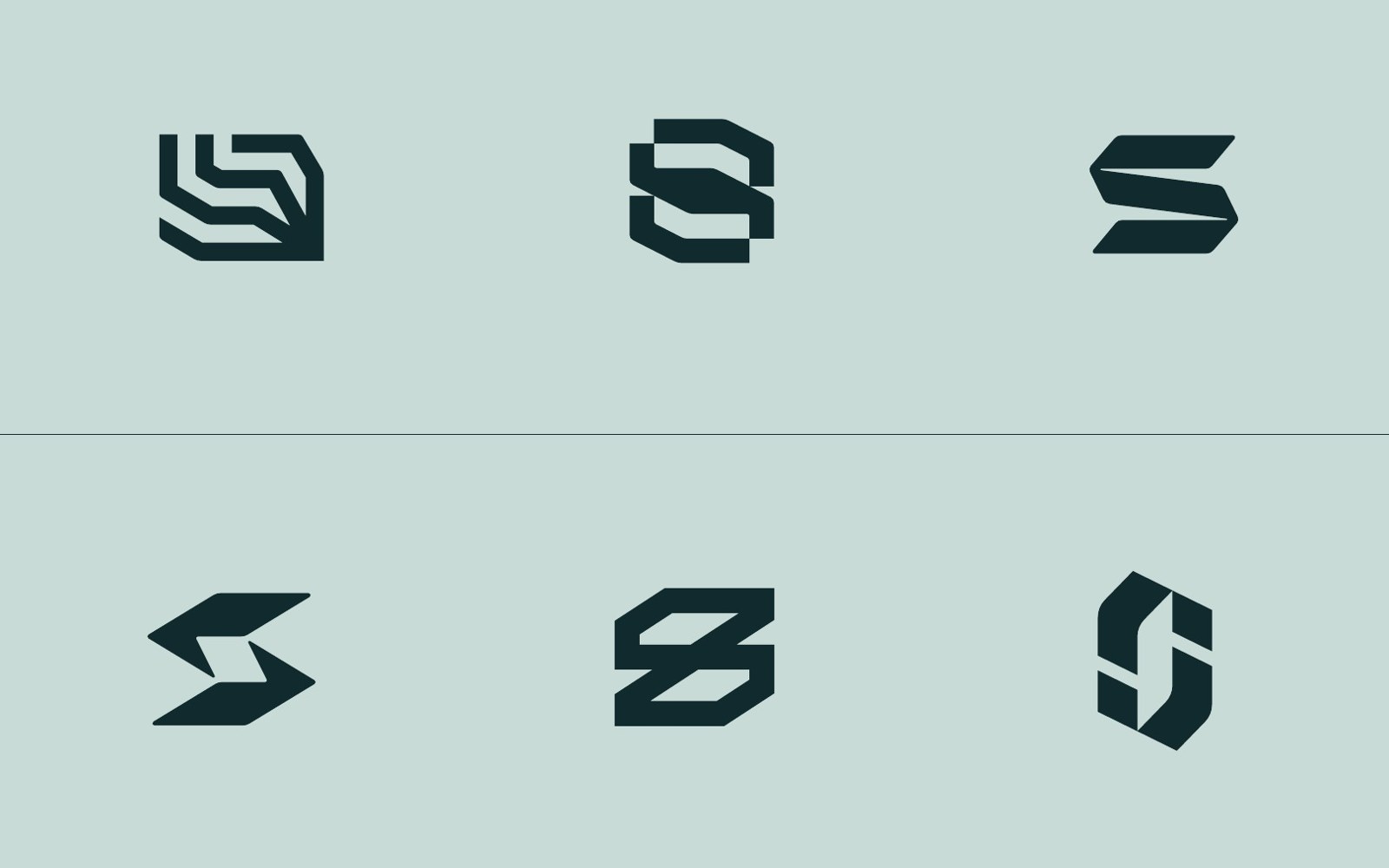
24 March to 7 AprilAfter a kickoff call and a review of the client's brand materials, we set a direction: minimal, geometric shapes with an architectural edge, drawn abstractly from surgical robot arms and from words like converging technology, forward motion and spanning distance. We drew six logomarks, from a layered robot-arm mark to several S monograms. The client liked the first, fourth and sixth, thought the first too intense (a few colleagues saw seaweed), and asked for something more sophisticated.
Refinement
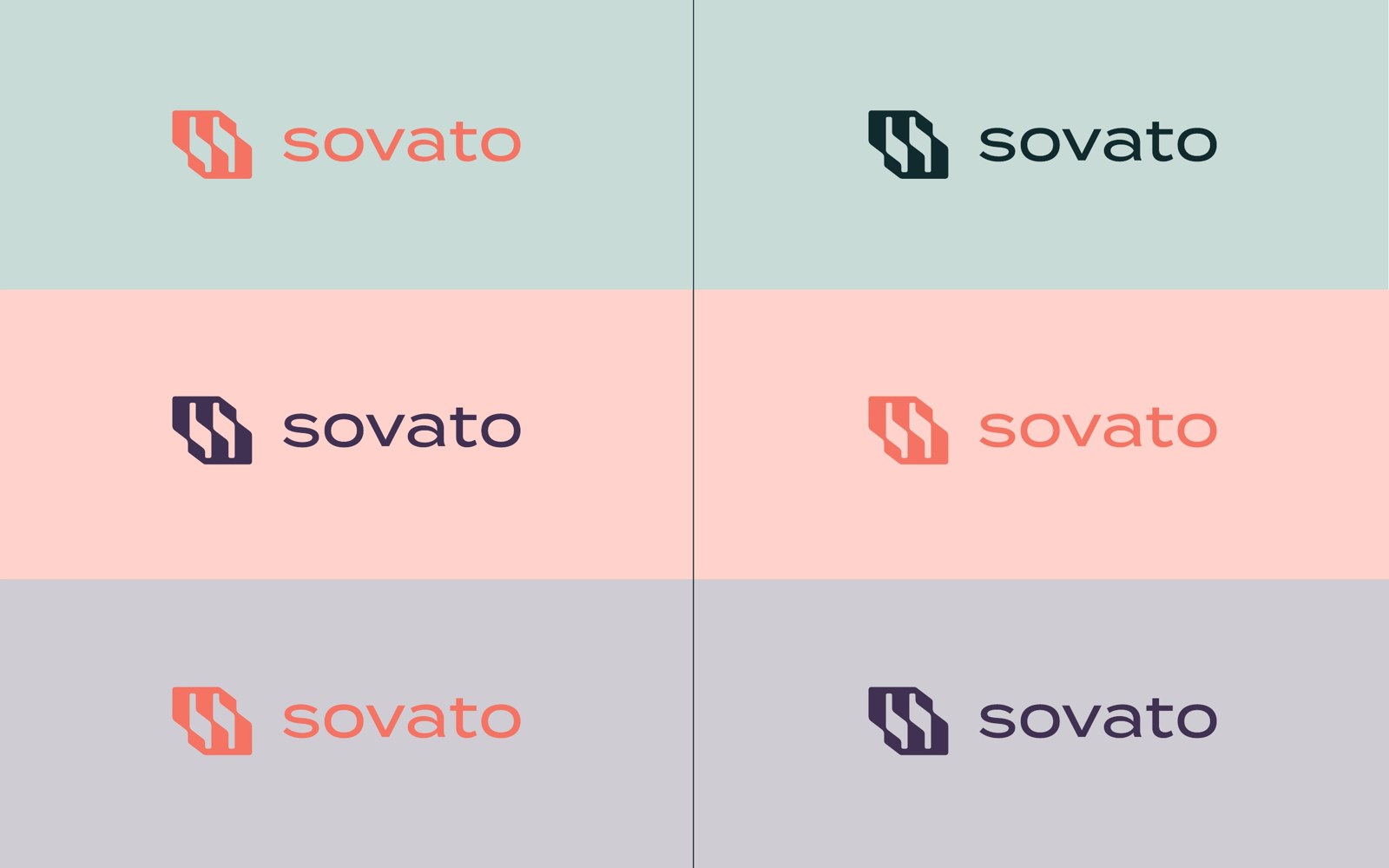
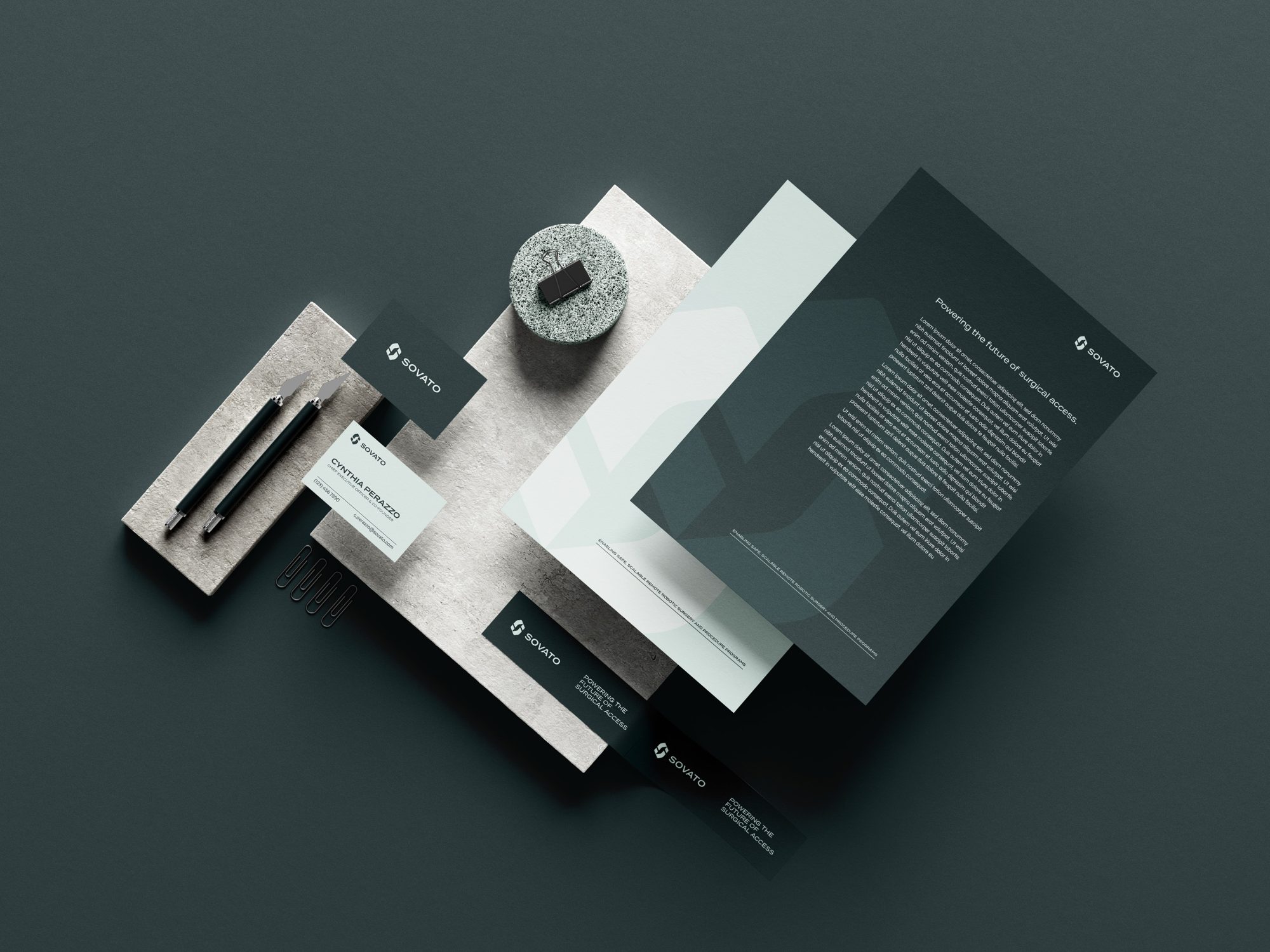
14 April to 2 MayWe read the feedback as a wish for less industrial and less masculine, and more elegant. We rethought the first concept as two new marks, softened the fourth and sixth, and tested the client's palette. Only complementary shades worked well together, so we advised against mixing colours inside the mark. On request we made white-background versions and mockups for a deck, letterhead and email signature, so the team could judge them in use. The client chose the last option, a compact monogram of two interlocking halves, for being modern and simple.
Type, colour and files
2 to 5 MayAsked to pick a typeface, we recommended Termina over Montserrat, which the client had grown fond of. Termina reads as technical and engineered, while Montserrat is overused. The client agreed. We tested a contrasting teal highlight inside the mark, and the client kept a single colour. We also found that some of the client's brand colour codes did not match their RGB values, and corrected them. Final files went out on 5 May in RGB and CMYK, with sources.
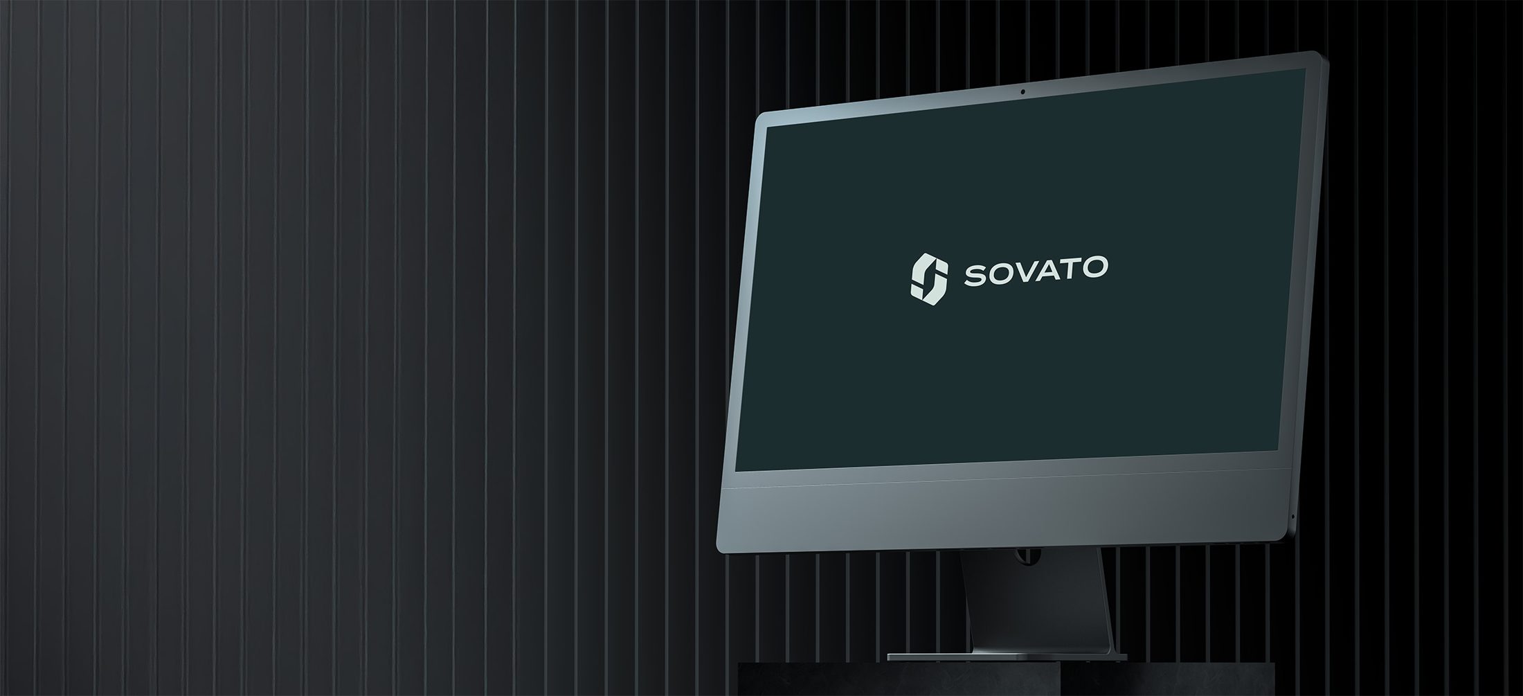
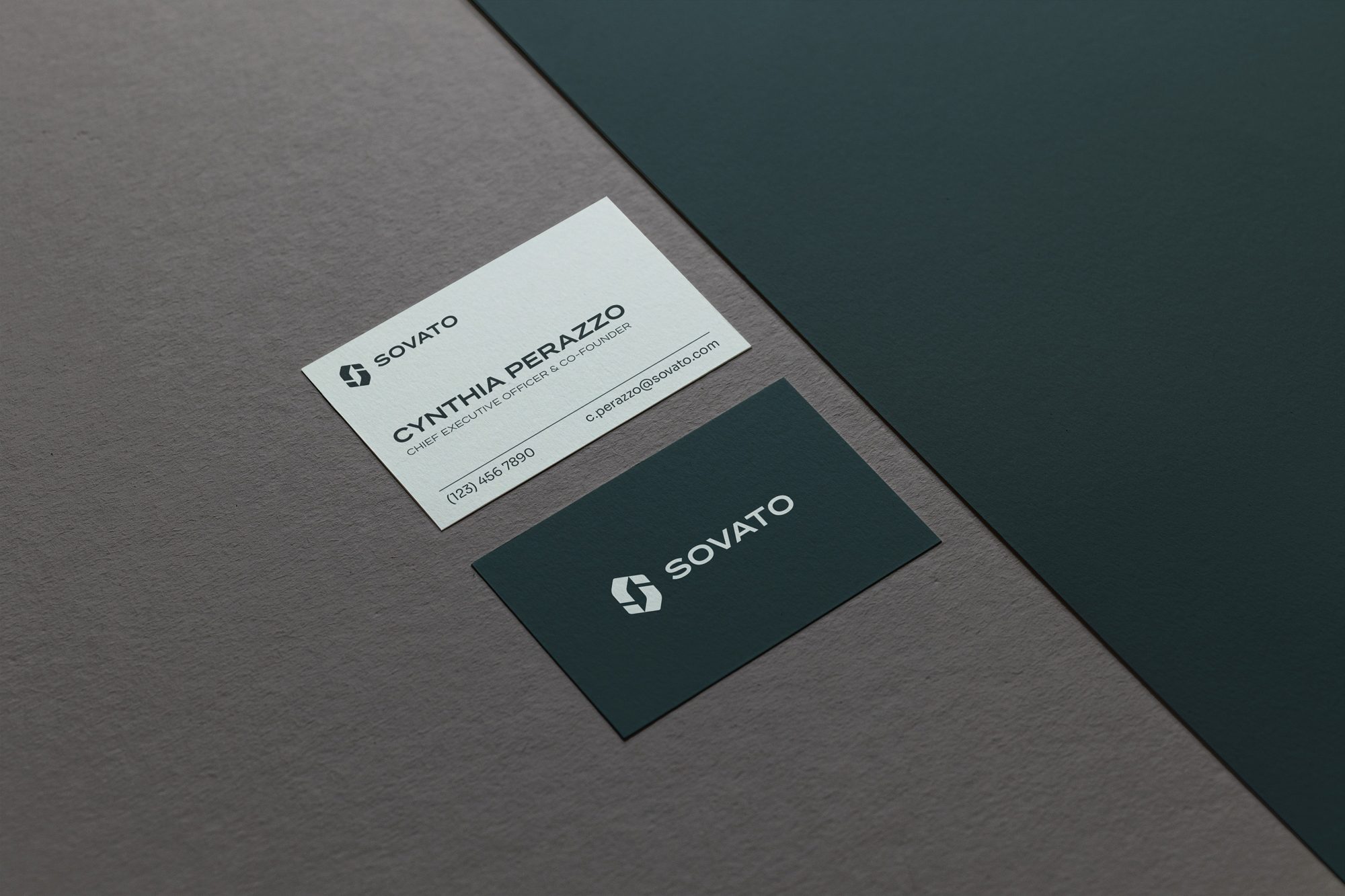
A compact monogram of two interlocking halves that works from a business card to a website header, and is still the mark on sovato.com today.
Every month without a coherent brand is lost ground.
A free 30-minute audit will show you where your identity and website are costing you clients, and what it would take to fix it.
No commitment and no pitch deck. Just a clear assessment.