Purple Squirrel
A new identity for an executive search firm, built around a squirrel that sits in the negative space of its own tail.

Purple Squirrel finds senior executives for corporate clients, and its logo was a cartoon squirrel in glasses carrying a briefcase.
The mascot was friendly, but it belonged to a smaller and more casual company than the one Purple Squirrel had become. Its glasses and briefcase lost their detail at small sizes, and a board hiring a chief executive was unlikely to take the firm seriously on first sight of it.
Keep the squirrel, and give it the polish of a firm that places executives.
How we found the answer.
Discovery and style direction
Weeks 1–2The client sent their brand information and answered a short questionnaire on personality. We then showed three style directions for the logomark: classical and detailed, a reduced heraldic line style, and an ultra-minimal geometric one. The brief was to look modern while staying elegant and established, so we recommended the middle style, with one option from the third as a contrast.
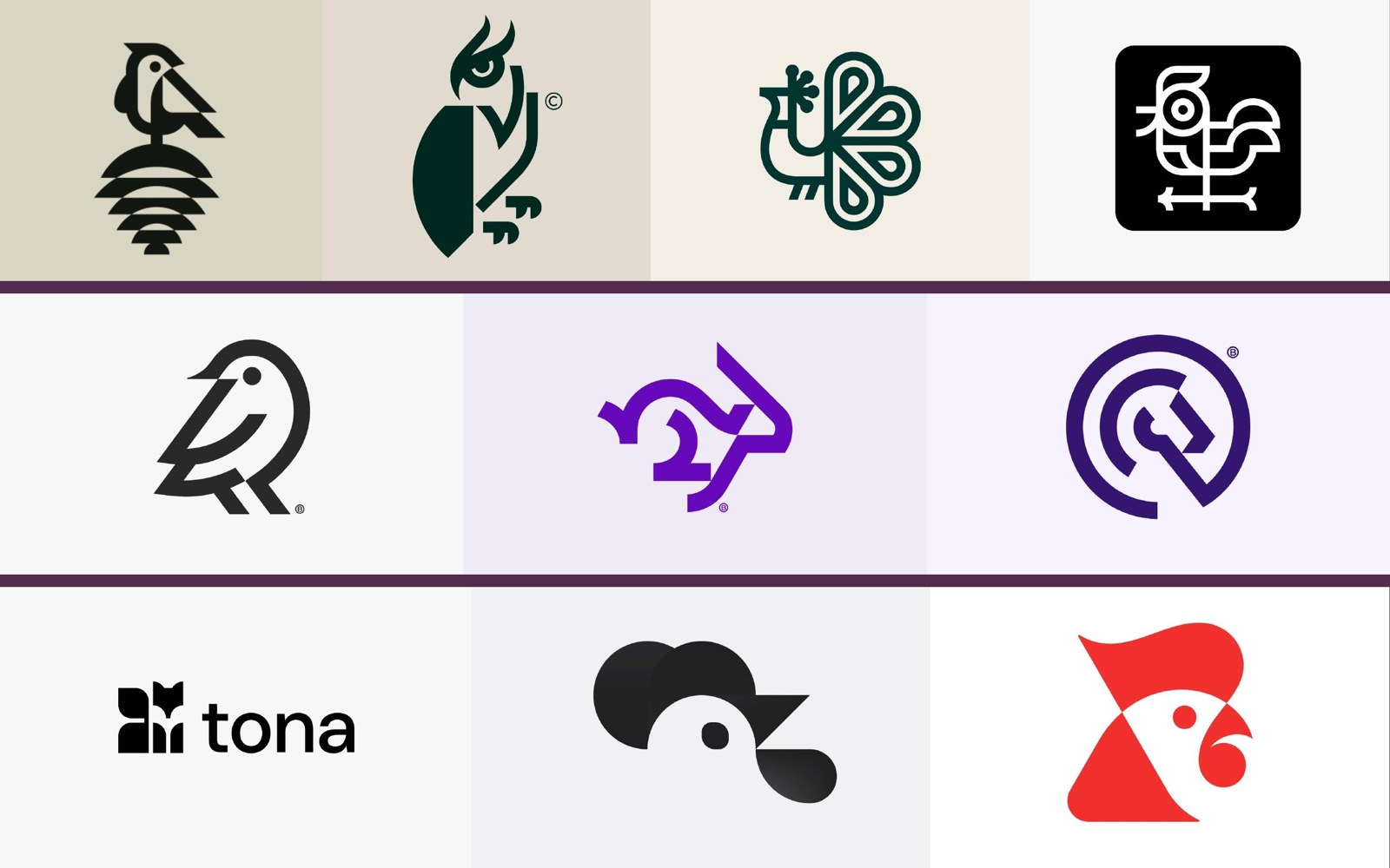
Logomark
Weeks 2–5We drew three squirrels. One was a folded, line-art figure, one an angular geometric shape, and one a soft form that places the squirrel in the negative space of its own tail. The client's team reviewed them together and chose the third. It was the roundest and warmest of the set, it read clearly at small sizes, and the tail wrapping around the animal gave the firm a sense of care that the other two lacked. We then smoothed the curves and tuned the proportions.
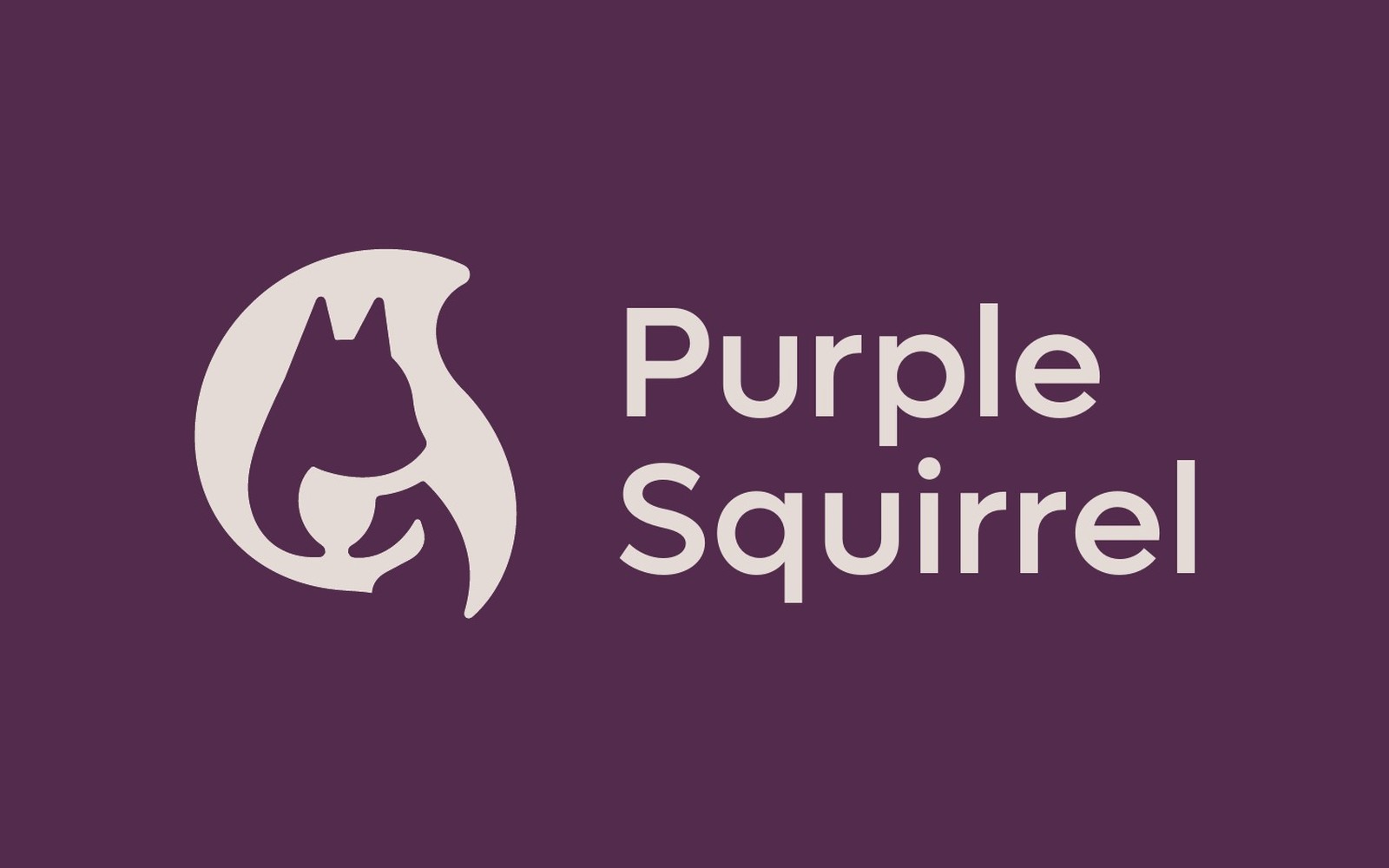
Guidelines and applications
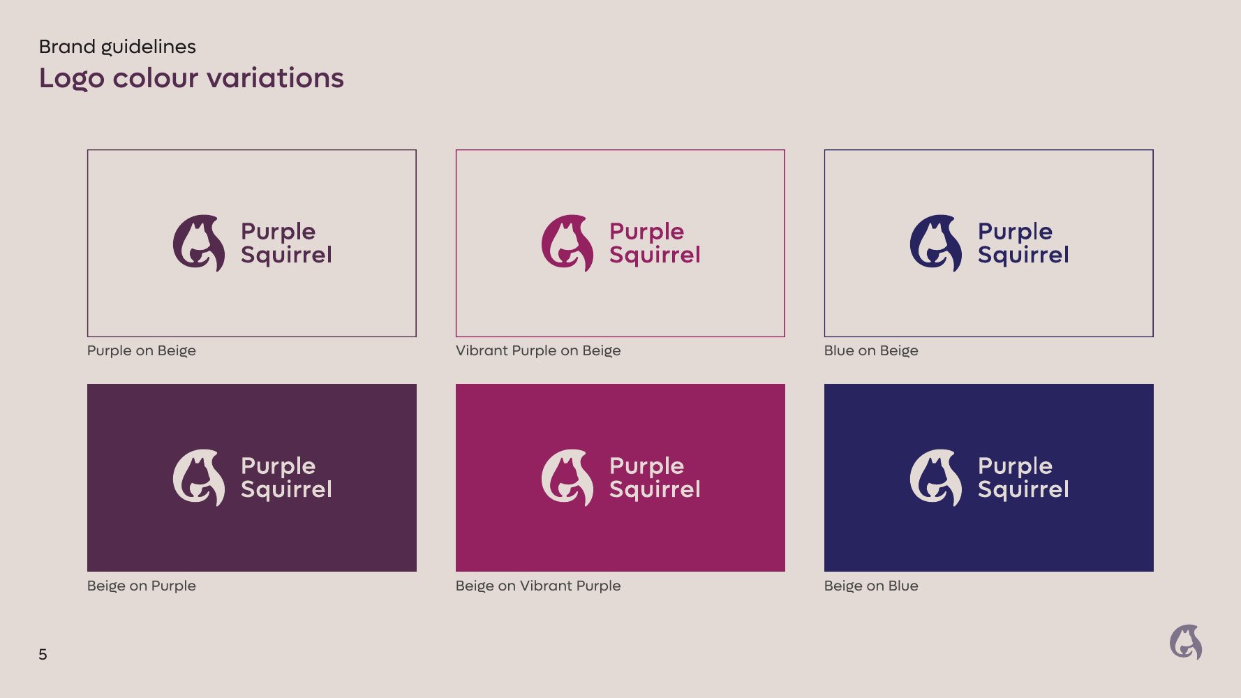
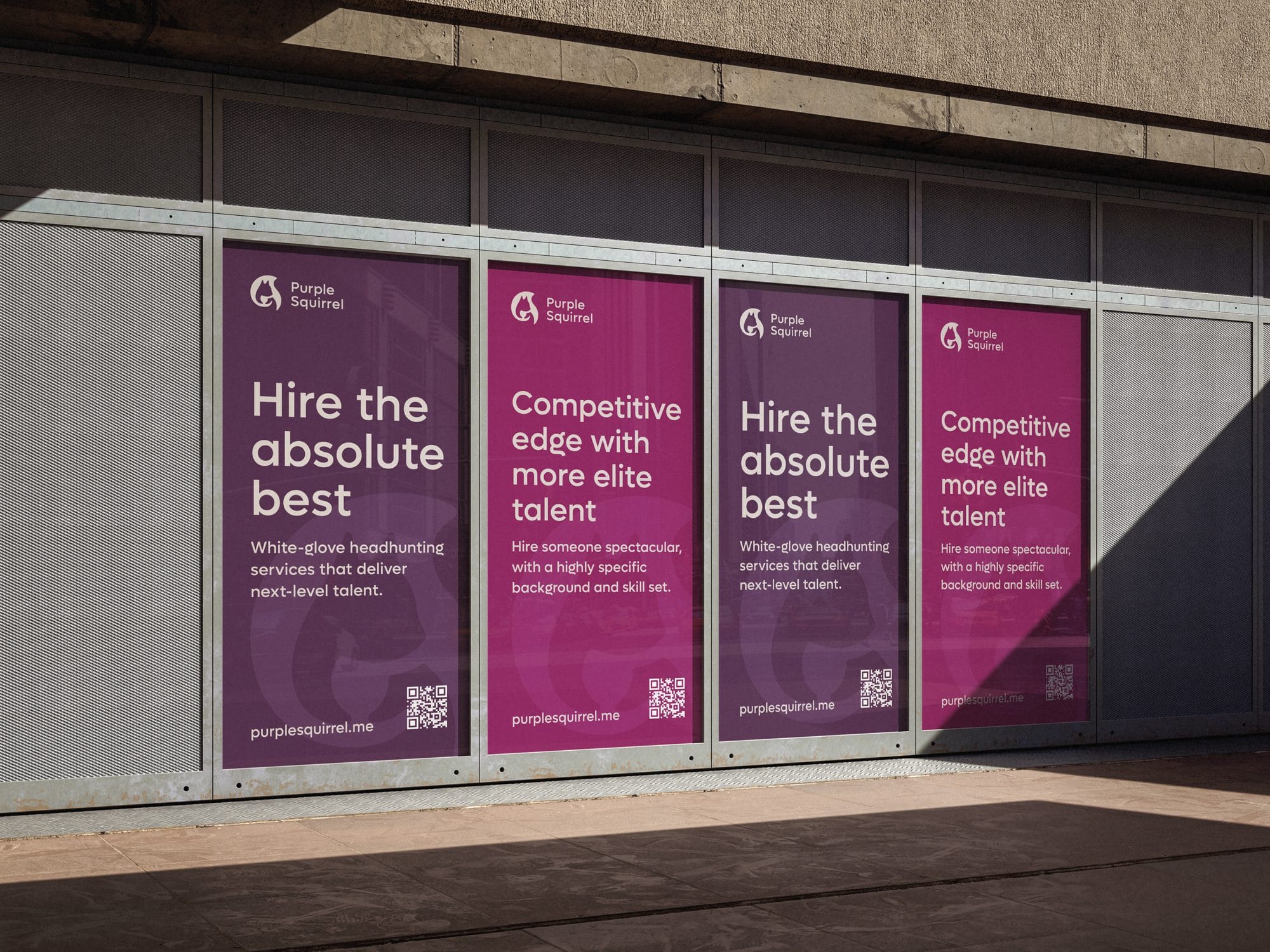
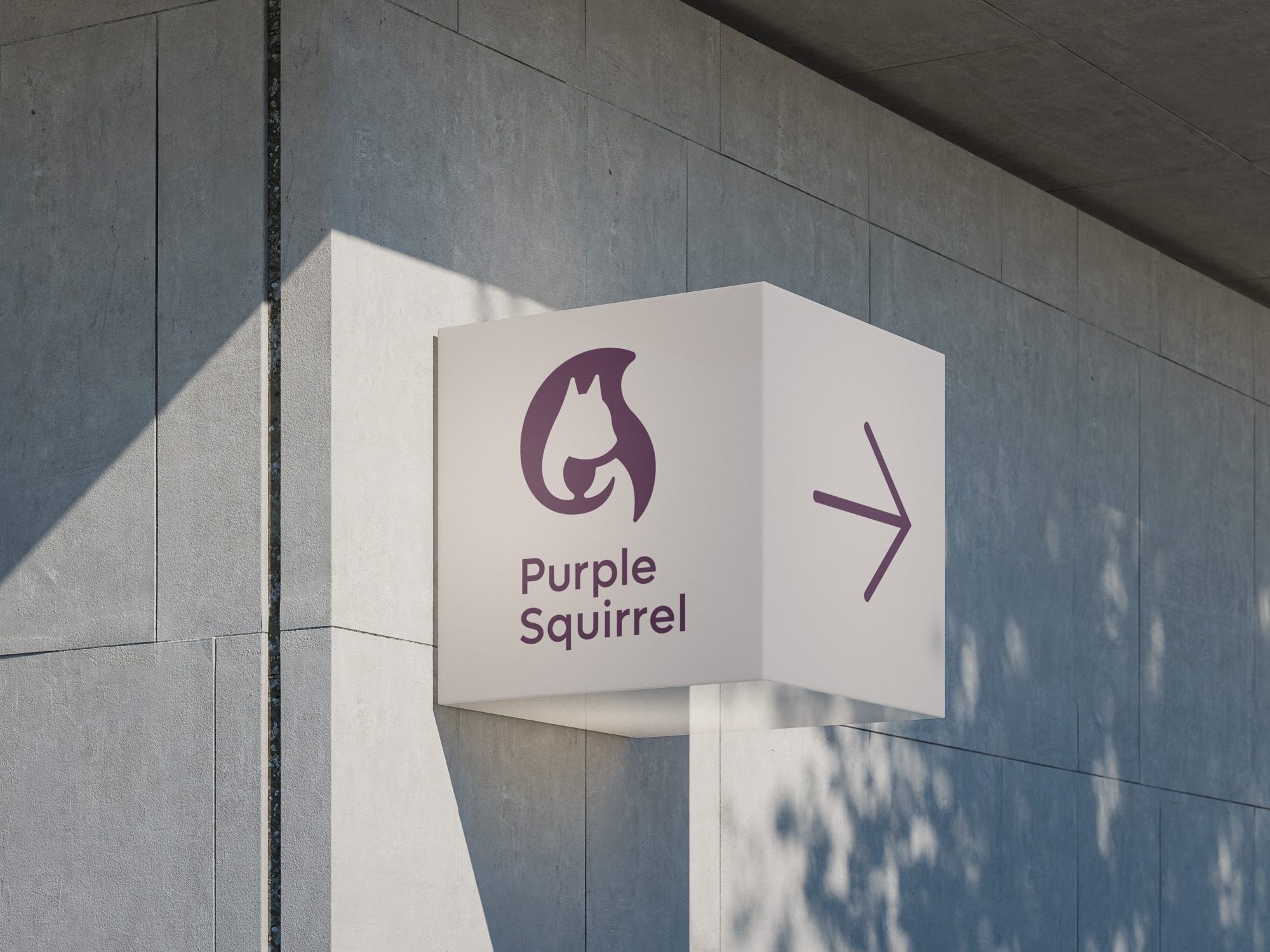
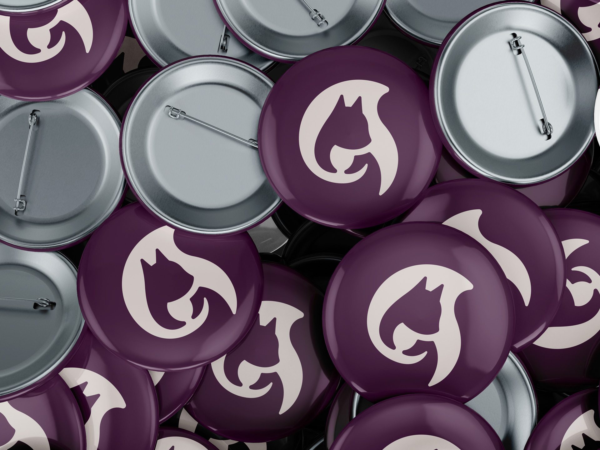
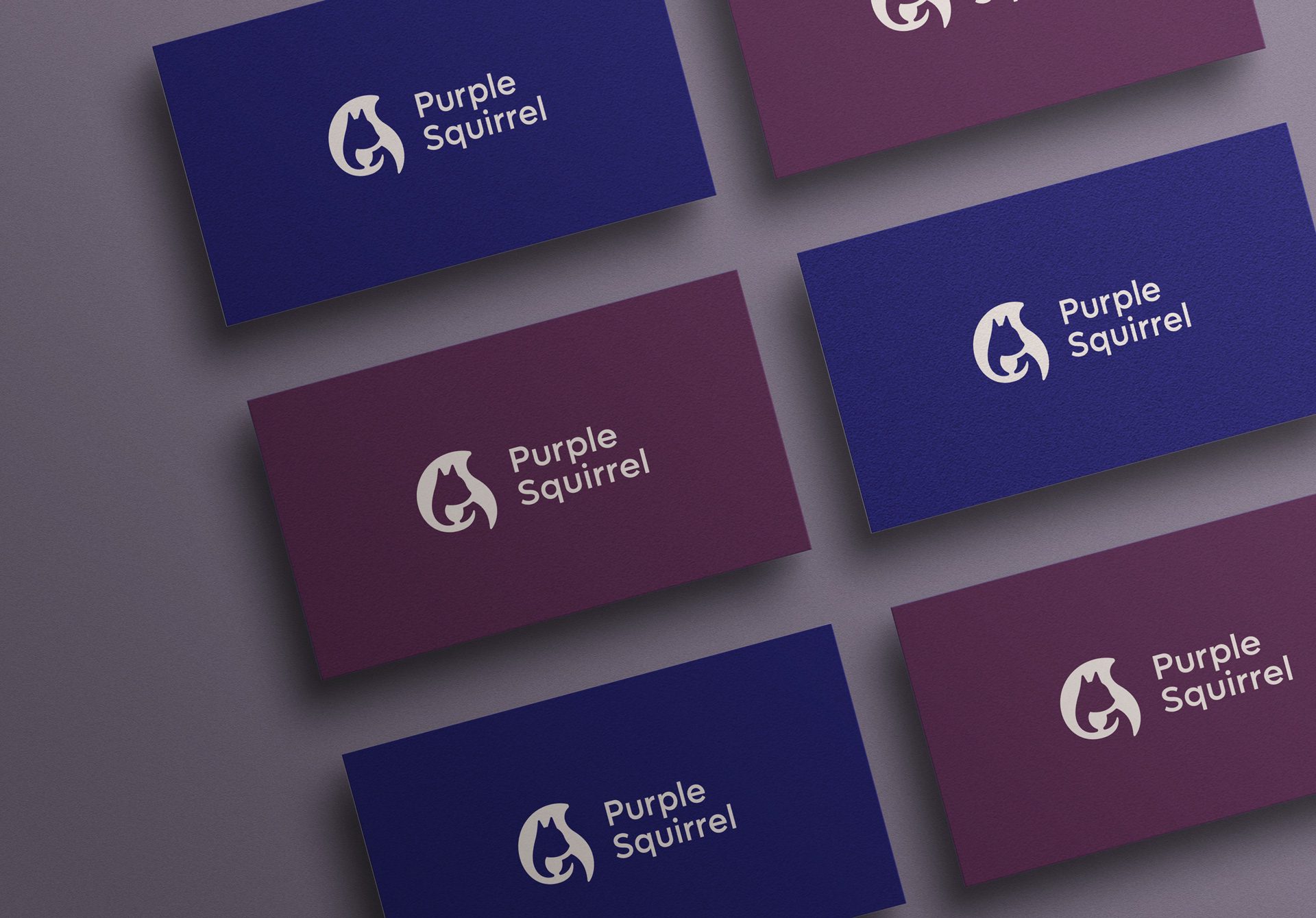
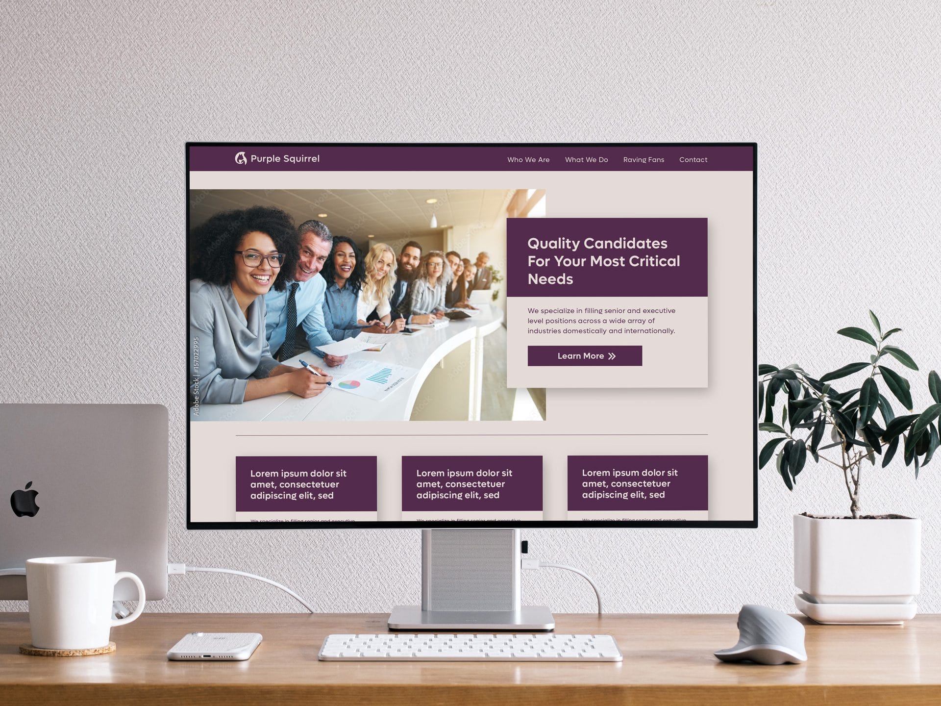
Weeks 5–7The client's plum, magenta, indigo and beige became a primary palette with three greys behind it. Lufga Medium sets headings and Lufga Regular sets text. We built lockups and six colour pairings, set the clear space and a 160-pixel minimum width, and delivered the whole thing as a 14-page guideline with mockups of cards, posters, badges and signage.
A soft, confident mark that keeps the squirrel, wraps it in its own tail and holds up from a badge to a billboard.
“Aidar was a pleasure to work with. He gave timely feedback and constantly checked in regarding communication and expectations. He exceeded expectations with his design and logo guide. Thank you for your help and amazing work!”
Every month without a coherent brand is lost ground.
A free 30-minute audit will show you where your identity and website are costing you clients, and what it would take to fix it.
No commitment and no pitch deck. Just a clear assessment.