The Human Experience Co.
A new identity for a behavioural-science leadership consultancy: an HX monogram that reads as a person, in deep teal with a single coral accent.

The Human Experience Co. coaches senior leaders through change with behavioural science, and its identity looked like the serious corporate firms it competes with.
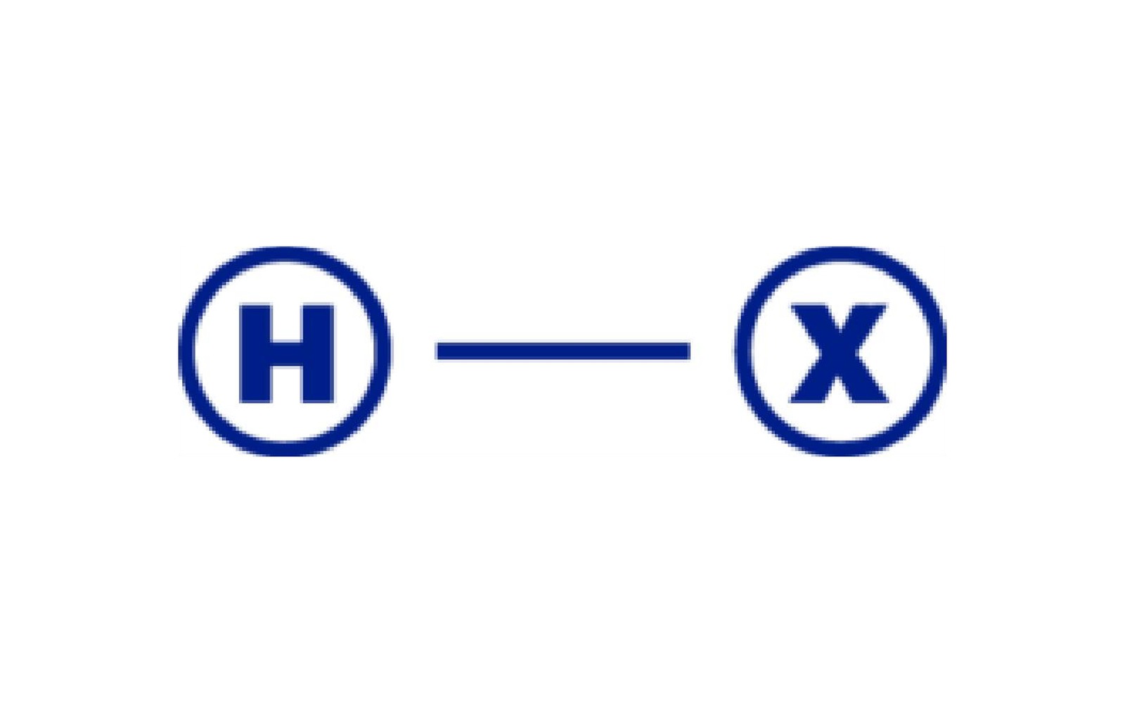
The client described the brand as energising, empathetic, compassionate, friendly and dedicated. The old mark joined an H and an X, each in a circle, with a line between them, and the blue-on-white palette is the default look of management consulting. Buyers who already compare the firm with Korn Ferry and Deloitte had little reason to see it as different.
Look professional enough for senior executives and human enough to be believed.
How we found the answer.
Diagnosis and style direction
16–17 AprilBefore drawing anything, we wrote down what the identity had to change. Against a brief that asked for warmth, the old mark was geometric, reserved and serious, and its line suggested a balance between two sides. We proposed softer shapes with some organic curves, a less neutral typeface, a circular arrangement of three or more elements to show collaboration, and a friendlier palette with one bright colour used sparingly. We went through it with the client on a 37-minute call.
Logomark
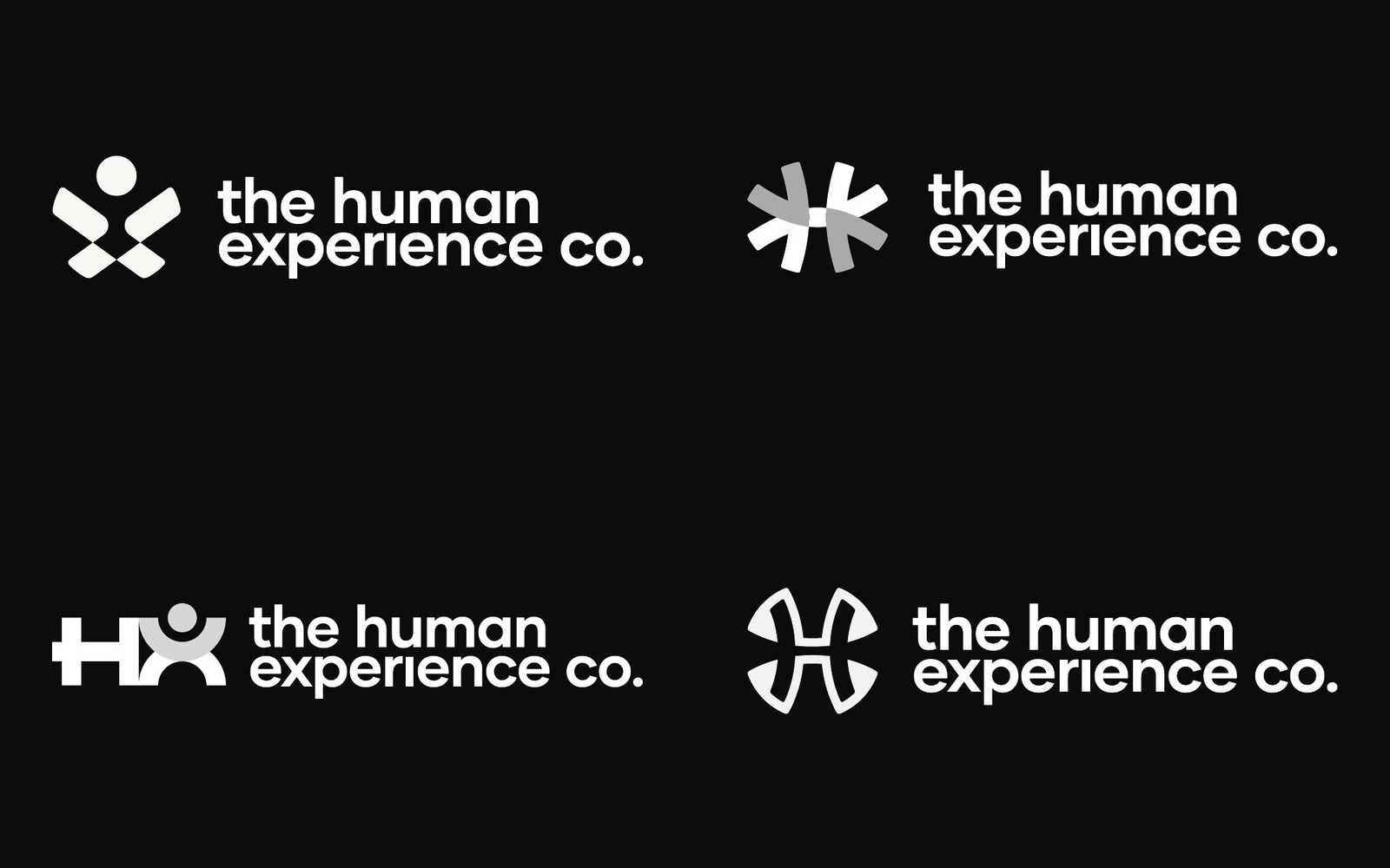
20–22 AprilWe drew four concepts: a figure built into the X, four arrows meeting at a centre, a geometric HX with a person in it, and arrows shaped into an X around the H. We recommended the first as the most meaningful. The client found it a little too playful and chose the third for its simplicity, saying it felt playful and sophisticated at once. It was also the sharpest of the four, so the warmth had to come from the colour. We added Co. to the name and kept it on two lines so the letters stayed large. We advised against bolding the H and X in the name, because it splits the wordmark and the domain already explains the monogram.
Palette, type and guideline
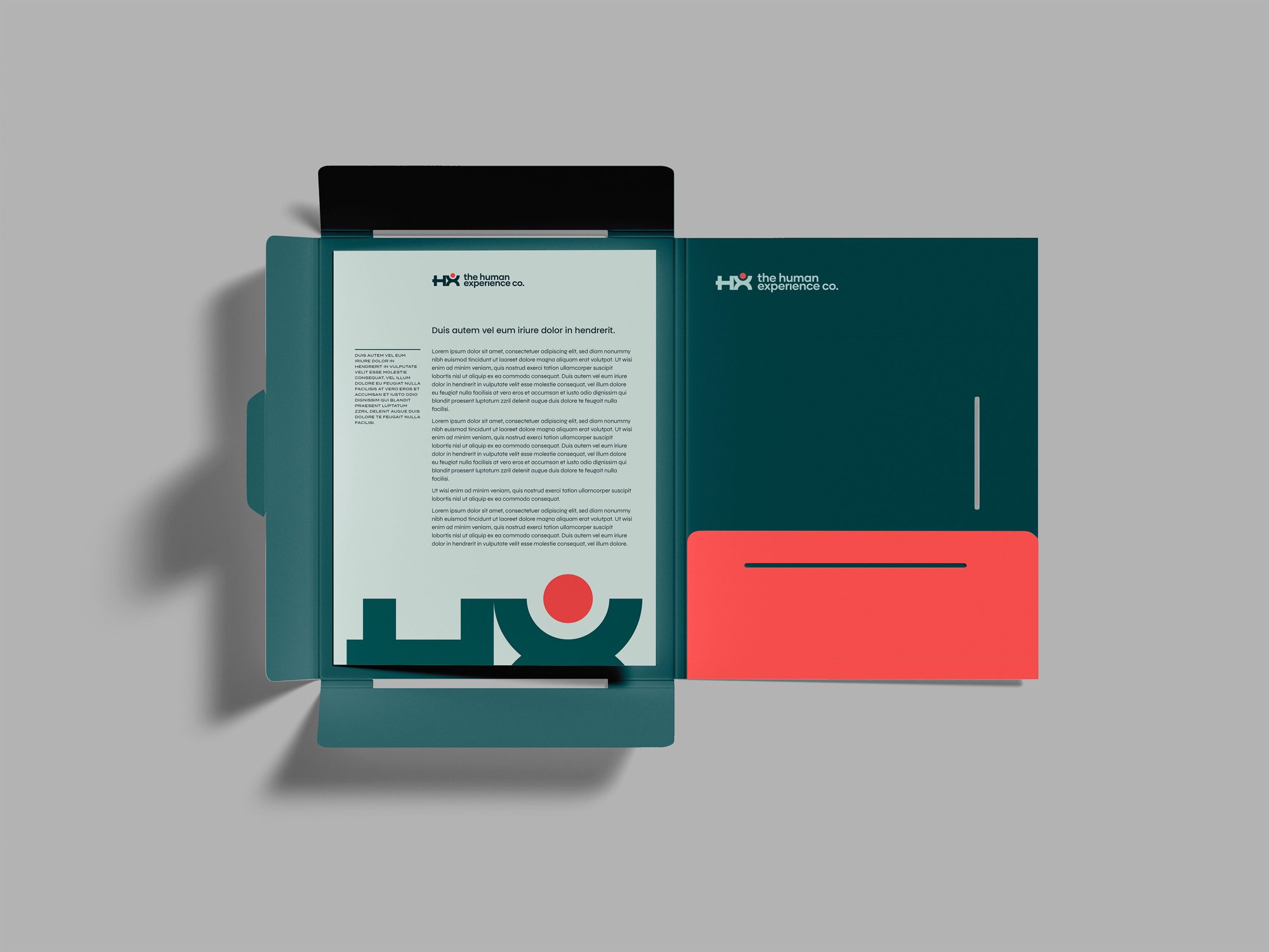
23–26 AprilWe showed five palettes. The client was drawn to the teal one and asked for something bolder, with a colour that stands out, ideally at the top of the X. We added a deep coral, which became the head of the figure and the single accent across the system. We checked the teal against a direct competitor's, and ours sits on the green side where theirs leans blue. Poppins Medium and Regular set the headings and text. Everything went into a 10-page guideline, followed by logo files in RGB and CMYK with sources, slide templates for a client presentation two days later, and business card layouts.

A person made of the letters HX, in deep teal with a single coral head: serious enough for a room of senior executives, and warm enough to be believed.
“I'm super happy with what we have here. Really pleased!”
Every month without a coherent brand is lost ground.
A free 30-minute audit will show you where your identity and website are costing you clients, and what it would take to fix it.
No commitment and no pitch deck. Just a clear assessment.