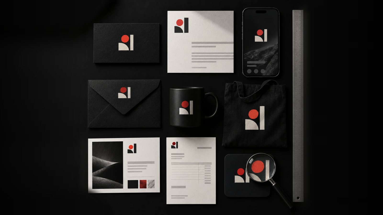
A brand consistency audit is a side-by-side review of every place your brand appears, done to find where it stops matching itself. It needs a spreadsheet, a folder for screenshots and about four hours. The output is a ranked list of fixes, each with an owner.
Why buyers notice
A prospect evaluating a professional services firm rarely sees a single asset. They open your LinkedIn page, then your website, then the proposal you sent, and they compare the three without meaning to. Two logo versions or two shades of blue tell them nobody owns the brand, and a buyer about to approve a budget reads that as a sign of how you handle detail. The mismatch does not have to be dramatic. A proposal template that still carries the logo from three years ago is enough.
What inconsistency looks like
It starts with deadlines. A landing page is needed by Friday, so someone rebuilds the header from memory. A sales deck is updated the night before a pitch, using last month’s deck instead of the master. An email signature keeps the old office address for two years after the move. Each shortcut is reasonable. Added together, they are how a brand slowly stops looking like itself.
An audit usually turns up the same findings:
- Several near-identical blues, each eyedropped from a different file.
- Two logo lockups, one with the tagline and one without, used at random.
- Headlines set in whichever font was installed on the laptop.
- Photography that changes style with every designer.
Step 1: List every touchpoint
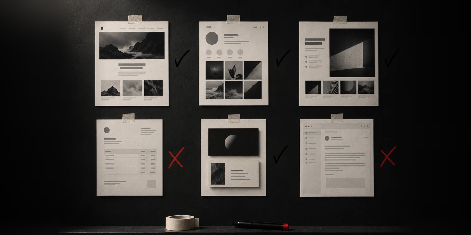
Write down every place a buyer or customer can meet the brand. Start with what you control directly: the website, your LinkedIn company page, other social profiles, your Google Business Profile, email signatures, proposal and pitch deck templates, invoices, business cards, PDF one-pagers and event banners. Then add anything a partner or agency produces for you, such as ads, webinar slides and the bio on a guest article.
Step 2: Capture each one at the same size
Take a screenshot or export a PDF page for every touchpoint and put them all in one folder. Name each file with the touchpoint and the date, for example linkedin-company-page-2026-06-24.png. The date matters because you will repeat the audit and need something to compare against.
Step 3: Build the comparison grid
Make a spreadsheet with one row per touchpoint. Give it a column for each brand attribute: logo version, primary colour hex code, secondary colours, typeface, headline style, photography style and the line that says what the company does.
Read hex codes with a browser eyedropper. For a website, the computed styles panel in your browser’s developer tools shows both the exact colour and the font family in use. Paste the values in. A cell either holds a value or it does not, so skip “looks right”.
Step 4: Mark each row
Compare every row with your current brand guidelines. Mark a row as matching when every attribute agrees, as drifted when one attribute differs, and as off when two or more differ or the logo is an outdated version. Count each group.
Read the pattern before the total. If the drifted and off rows are mostly files created after the brand launched, the gap is templates: people had nothing easy to start from. If the drift shows up even in files made just after launch, the identity is missing rules such as minimum logo size, colour weighting, spacing and type hierarchy, and templates will only copy those gaps at scale. That second case needs design work on the system itself.
Step 5: Find the cause of each gap
For every off row, find out who made the file and what they started from. The answers tend to be specific. The master template is a locked PDF. The current logo files sit in a folder nobody was told about. A freelancer never received the guidelines. Write the cause next to the row. If you fix the file and leave the cause, the same gap appears the next time someone is in a hurry.
Step 6: Rank the fixes by who sees them first
Order the list by when a buyer meets each touchpoint. For most firms that means the website, then the LinkedIn page, then the proposal, then the pitch deck. Fix them in that order and give every item one owner and a date. A fix list without owners is a document.
Step 7: Fix it at the source
Set up one master folder. It holds the approved logos (SVG and PNG, light and dark versions), the colours with their hex and RGB values, the fonts and the current templates. Build the templates inside the tools your team already uses: a locked master in Google Slides or PowerPoint, a shared component library in Figma, a brand kit in Canva if that is where marketing works.
Name one person as the owner of the folder and give them the authority to say which version is current. Delete retired files. Archiving them beside the current ones means someone will pick the wrong one on a Friday afternoon.
Repeat it every quarter
Run steps 2 to 4 again each quarter, using the dated screenshots from the last pass. With the grid and the folder structure already in place, it comes down to replacing screenshots and updating cells.
If you want someone else to run it
We run this as a free 30-minute brand audit. You send the touchpoints, and we review them against your identity and tell you where the brand is strongest and where it leaks credibility. Use the Book free audit button at the top of the page.