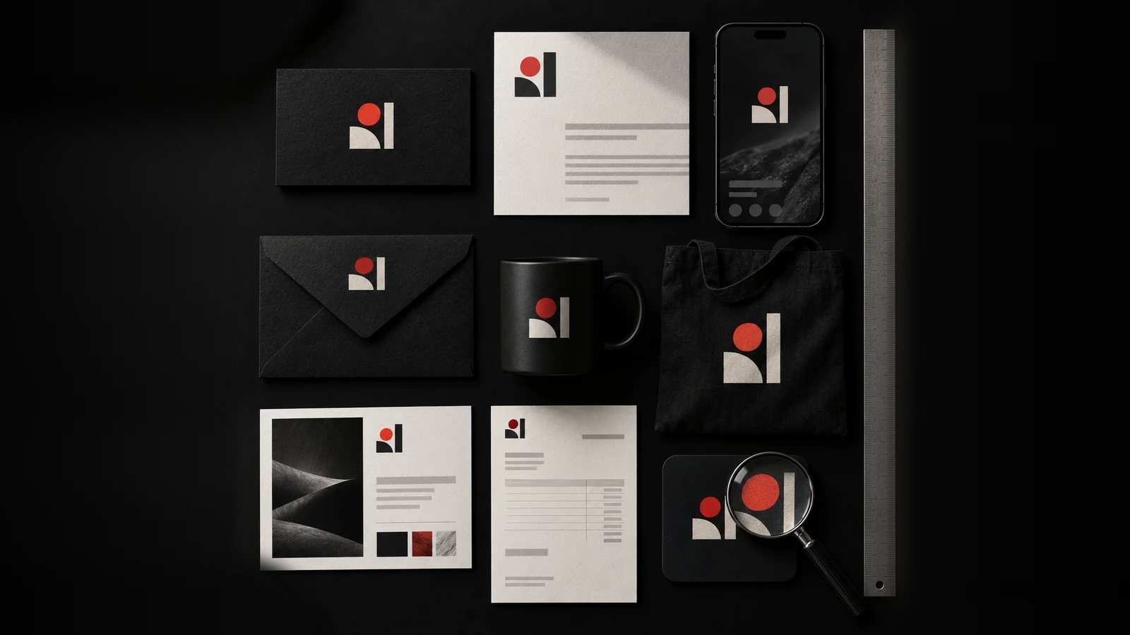
You have two or three quotes for a new identity, and no two list the same things. A brand identity package should cover the decisions someone outside the studio will face in the first year: which logo to use where, which colours go together, how type behaves, and what not to do. Below is the list we work from, then one project that shows each part in practice.
The short answer
| Deliverable | Include? | Why |
|---|---|---|
| Strategy: audience, positioning, personality | Essential | Every design decision is judged against it |
| Logo system: main lockup, stacked version, symbol, one-colour versions | Essential | One logo file cannot cover a favicon and a sign |
| Colour palette with hex, RGB and CMYK values, plus rules for using it | Essential | Values for screen and print, and how much of each colour |
| Typography: typefaces, weights and levels | Essential | Headings, body and small text set the same way everywhere |
| Brand guidelines | Essential | The rules your team uses when the studio is not in the room |
| Logo files in RGB and CMYK, with source files | Essential | Printers and developers ask for these in the first week |
| Templates for what you make most: deck, proposal, social, email signature | Worth adding | The next thing your team makes will be one of these |
| Stationery: business card, letterhead | Worth adding | Only if things still go out on paper |
| A 100-page brand book, merchandise, a brand film | Can wait | Useful later, rarely needed in year one |
One package, start to finish
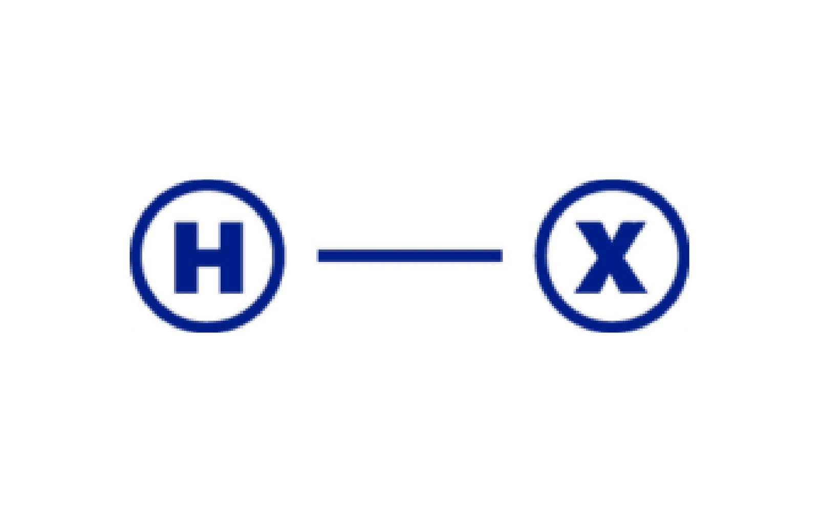
The Human Experience Co. coaches senior leaders through organisational change. Its old identity, an H and an X in blue circles joined by a line, looked like the corporate consultancies it competes with. The whole identity took two weeks, and every essential line in the table above was in it.
Strategy first
The brief fitted in one line: look professional enough for senior executives and human enough to be believed. The client named two direct competitors, MindsOpen and August, and asked to look like neither. Before drawing anything, we wrote down what the identity had to change: softer shapes, a less neutral typeface, a way to show people working together, and one bright colour used sparingly. On our projects you sign that off before any design starts, because every concept is judged against it. If a quote begins with “logo concepts”, ask where this step is. Brand positioning for a rebrand covers the decisions it records.
A logo system
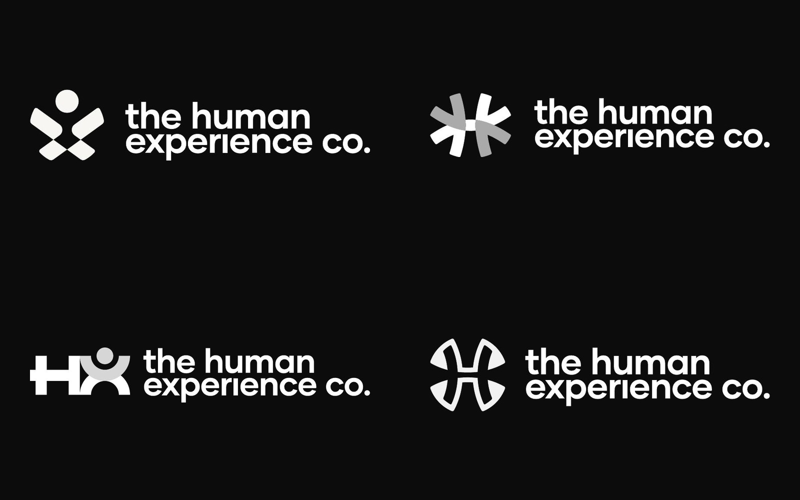
We drew four concepts: a figure built into the X, four arrows meeting at a centre, a geometric HX with a person in it, and arrows shaped into an X around the H. The client chose the third, which it described as playful and sophisticated at once. We added “Co.” to the name and kept it on two lines so the letters stayed large. We also advised against bolding the H and the X inside the name, because it splits the wordmark. A rule like that belongs in the package: without it, someone bolds them the first time the name needs emphasis.
Ask any studio how many concepts you will see and how many revision rounds are included. We run two structured rounds, one after the first concepts and one after refinement.
Colour with rules attached
We showed five palettes. The client chose the teal direction and asked for one colour that stands out, so a deep coral became the head of the figure and the single accent across the system. A palette is only useful with values and rules: hex, RGB and CMYK for each colour, which colours sit on which backgrounds, and roughly how much of each to use, so the accent stays an accent. We also checked the teal against a direct competitor’s. Ours sits on the green side, theirs leans blue.

Typography with levels
Poppins Medium sets the headings and Poppins Regular the text. Name the typefaces, the weights and the levels (headings, body, small text), and say where each is used. That stops a new hire setting a proposal in whatever the laptop offers.
Guidelines your team will open
Everything went into a 10-page guideline, followed by logo files in RGB and CMYK with their sources. Length matters less than coverage: a guideline has to answer which logo goes where, how small it can go, how much room it needs, which colours go together, and what not to do. Designing a brand that scales lists what a guideline needs to hold up after launch.
What is worth adding
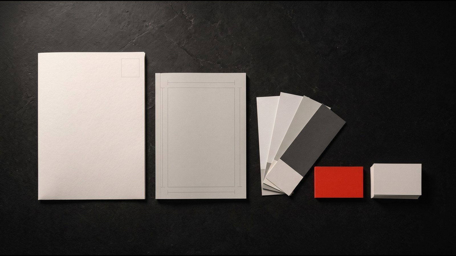
Templates. The first things a team makes after launch are slide decks, proposals and social posts. The Human Experience Co. had a client presentation two days after the identity was due, so slide templates joined the deliverables, with business card layouts. If you know what your team makes every week, put it in the package.
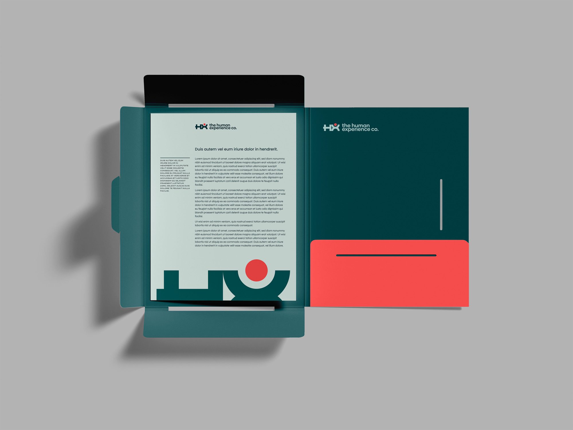
Mockups in use. Seeing a mark on a sign, a lanyard or a folder is the fastest way to judge it before you sign off.
Tone of voice. If your team writes proposals, posts and emails every day, a page on how the brand sounds will be used more than any colour rule.
What can wait
A long brand book, branded merchandise and a brand film all have their place, usually once the identity has been in use for a while and you know where it is under strain. Paying for them before launch spends budget on things few people will see, and leaves less for the templates and guidelines your team needs on day one.
Common mistakes when comparing quotes
- Comparing logo counts. Ten concepts with one revision round give you less than four concepts with two. Ask about rounds.
- Missing file ownership. Check that you will own every file outright, with nothing licensed back. On our projects you do.
- No guidelines, or guidelines as an extra. Without them, the identity starts to drift with the first file someone else makes.
- No one-colour or small-size versions. These are the first things a printer, a sign maker or a social platform will ask for.
- No templates for the things you make every week. The team then rebuilds the brand from scratch in PowerPoint.
Questions buyers ask
How long does a brand identity package take? Ours take 3 to 5 weeks, starting with discovery and strategy. A focused rebrand can be shorter: The Human Experience Co. took two weeks. Brand and web together take 7 to 9 weeks.
How much does a brand identity package cost? Our brand identity projects start from £2,200, and brand and web together from £4,400. We confirm the price after a free 30-minute audit, once the scope is clear. The Services page shows what each includes in your local currency.
Is a website part of a brand identity package? Usually it is a separate project with its own design and build. We offer brand and web as one project, so the identity is designed with the site in mind from the start.
What should I prepare before asking for quotes? A one-page brief: the problem, the audience, competitors to avoid, what must stay and where the brand has to work. How to brief an identity project has a template.
If you have quotes on the table now and want a second opinion on what they include, the free audit is a good place to start. It is a 30-minute call with Aidar, followed by a one-page summary with your top three fixes. Book your free audit.