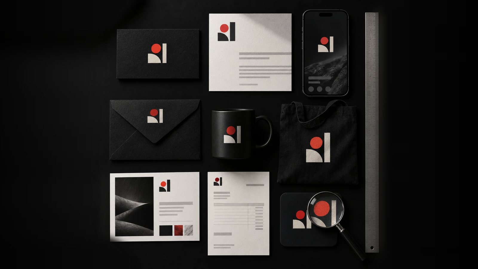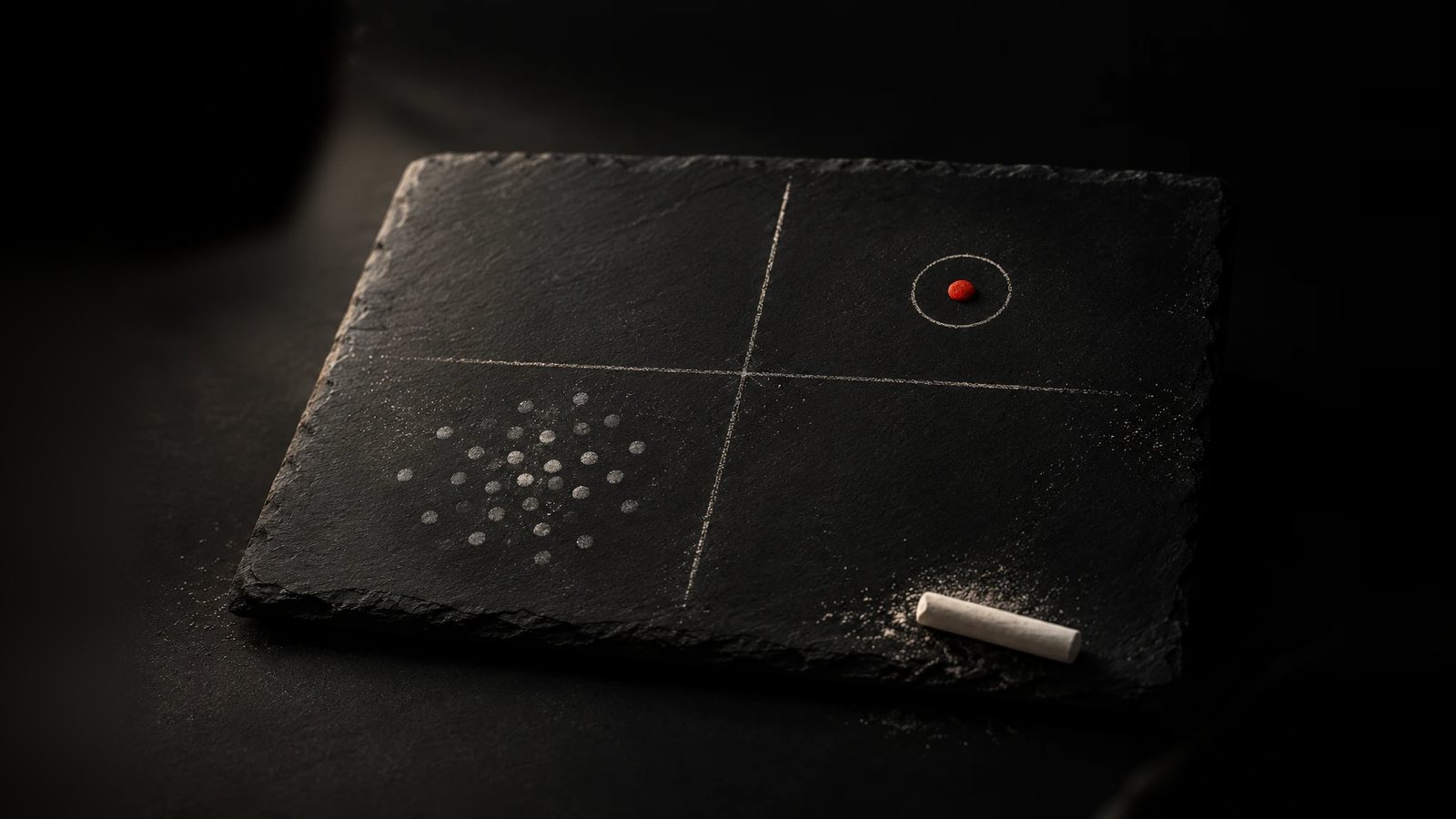
Every category develops a visual dialect: the same blues, the same photography, the same confident sans-serif. Recognising it is the first step to stepping outside it.
Map the territory
The Human Experience Co. coaches senior leaders through organisational change, and its old mark (an H and an X, each in its own circle, joined by a line, set in blue on white) was the default look of management consulting. That says more about the category than about this one mark: the blue-on-white palette, the balanced geometric monogram, the restraint that reads as “serious” because every firm in the space has agreed to signal seriousness the same way. You can’t see that a look is generic until you’ve lined it up next to everyone else using it.
The brief named the field directly: two competitors, MindsOpen and August, with an explicit instruction that the new mark and palette needed to look like nobody on that list. Naming the competitors wasn’t an act of comparison for its own sake. It turned a vague goal (“look different”) into a specific one (“look like neither of these two, in particular”), which is a brief a designer can actually test concepts against.
Find the gap, and make it a decision, not a mood
Once the category’s default is named, the gap is usually the thing the default refuses to do. Management consulting’s blue-on-white palette signals restraint and balance, so the gap was warmth and collaboration: softer, more organic shapes instead of the old mark’s strict geometry, a circular arrangement of several elements instead of a single symmetric line, and one bright colour used deliberately instead of the category’s usual monochrome caution. None of that was a style preference. Each choice was a direct answer to something the category’s visual dialect had agreed not to do.
Compare the actual values
The part of this process that’s easy to skip is checking your own output against a competitor’s at the level of the actual values, not the general impression. Once The Human Experience Co.’s new identity had a real teal in it, we checked that teal directly against a named competitor’s own teal: ours sits on the green side of the hue, theirs leans blue. That’s a distinction nobody would catch comparing mood boards, and it’s the difference between “we think we look different” and knowing it, in hex values, before the mark ever ships.
Borrow the logic, not the look
Sometimes the most useful reference isn’t a competitor at all. On Online Speechie, a speech-pathology brand for parents of late talkers, the brief pointed to Lovevery, a children’s product brand entirely outside the category, as a reference for how colour should feel: warm without tipping into saccharine. That’s borrowing a principle, not a palette. Copying a direct competitor’s colours gets you mistaken for them. Borrowing the reasoning behind a brand that solved a similar emotional problem, in a different market, gets you somewhere a competitor audit alone never would.
When the market tells you something uncomfortable
Reading the category also means reading your own concepts the way a stranger would, especially when the feedback is unflattering. On Sovato, an early logomark built around converging, organic lines was meant to read as advanced and architectural. Instead, a few people on the client’s own team saw seaweed. That reaction didn’t mean the concept was bad. It meant the shape was landing in the wrong part of the visual dialect, closer to “natural” or “biological” than “deep tech,” and it was far cheaper to hear that from a colleague’s offhand comment than from the market after launch. The same discipline that maps a competitor’s blue-on-white sameness has to turn on your own work too, or you’ll spend the budget avoiding a copy of your rivals and still end up looking like something nobody meant to make.